I design visual identities for conferences and events, create music covers and books, draw logos, and play around with typography.
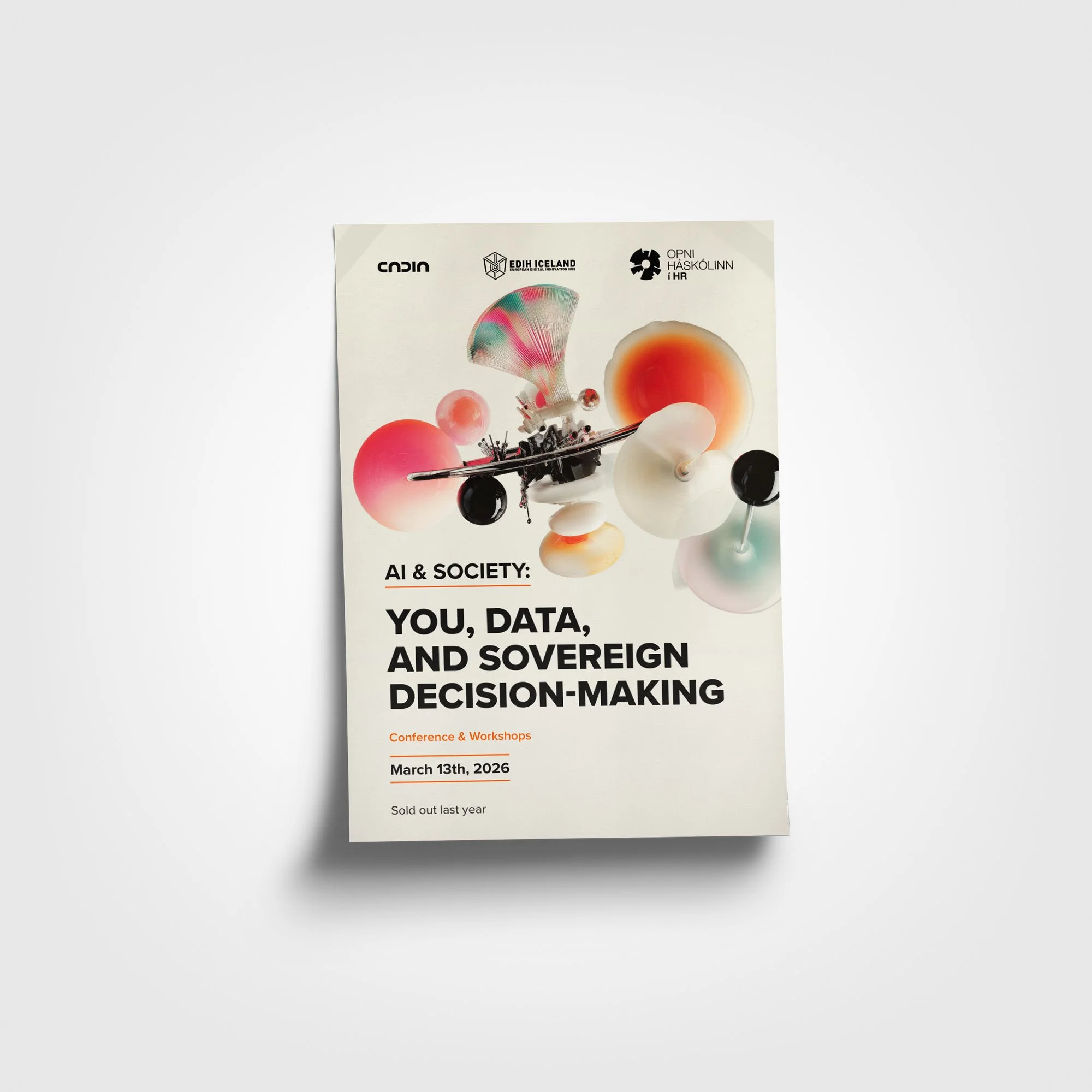
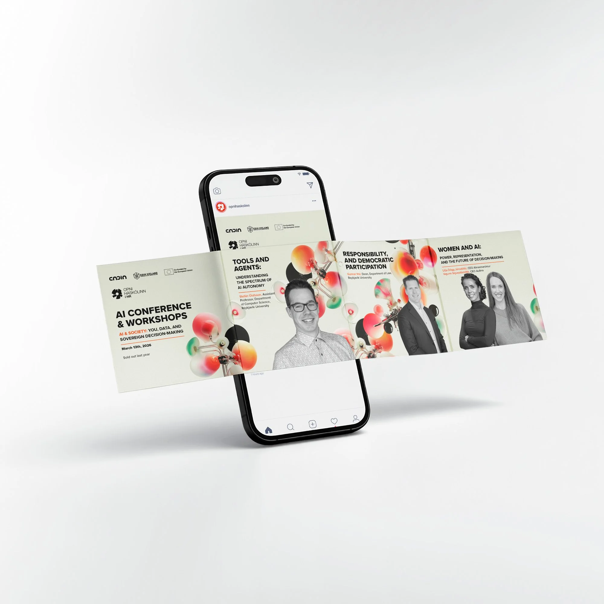
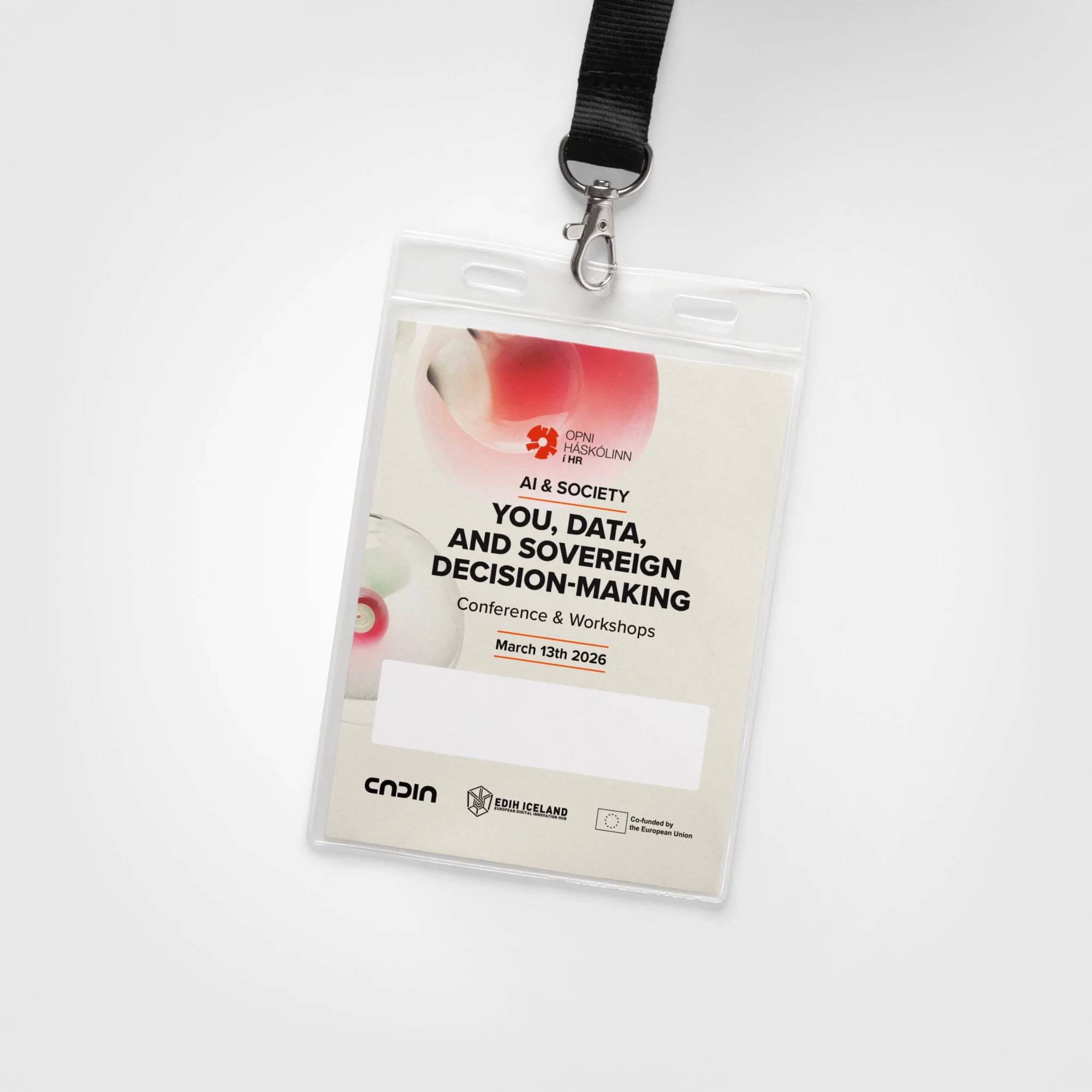
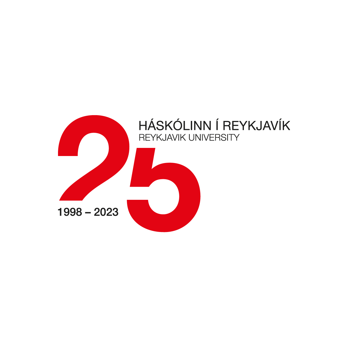
Visual Identity for AI Conference
A visual identity created for an AI conference hosted by Reykjavík University. The design needed to feel contemporary and intelligent without falling into the usual AI clichés of robots, glowing brains, and generic tech imagery. The result focused on structure, clarity, motion, and abstract systems, giving the conference a strong visual language that could work across posters, screens, social media, signage, and event material.
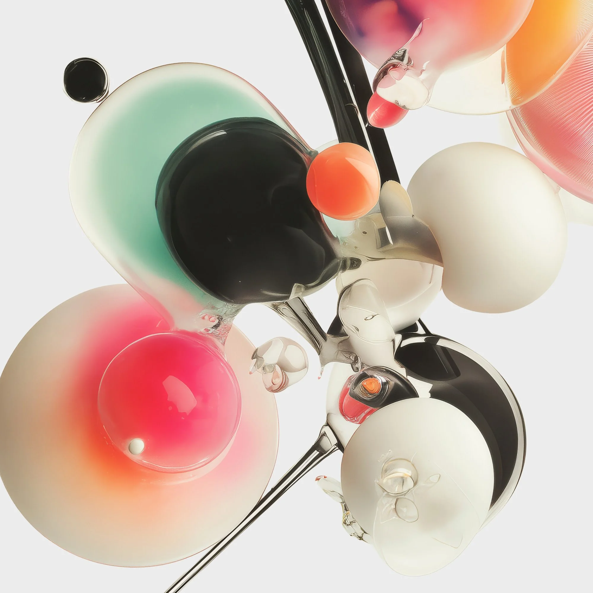
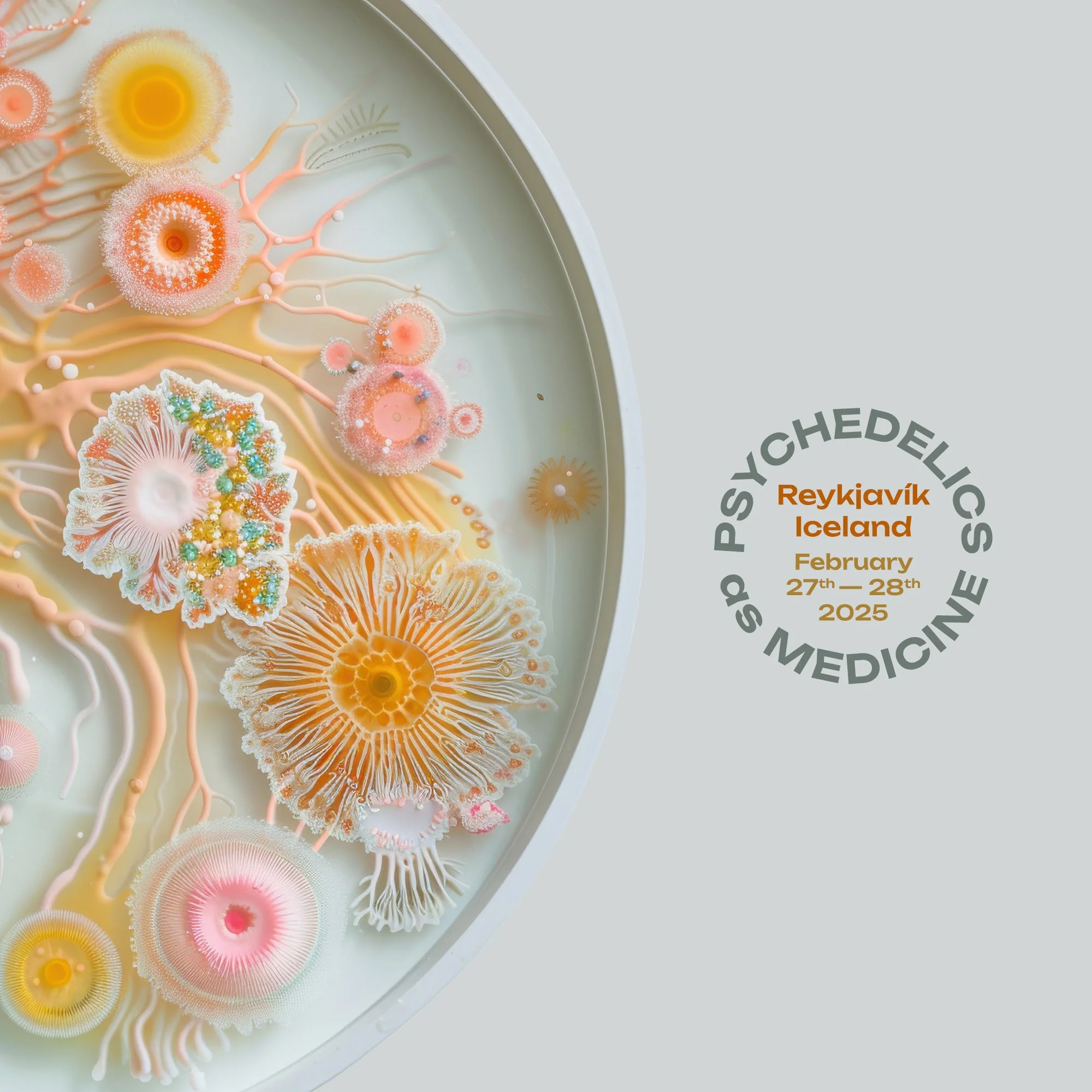
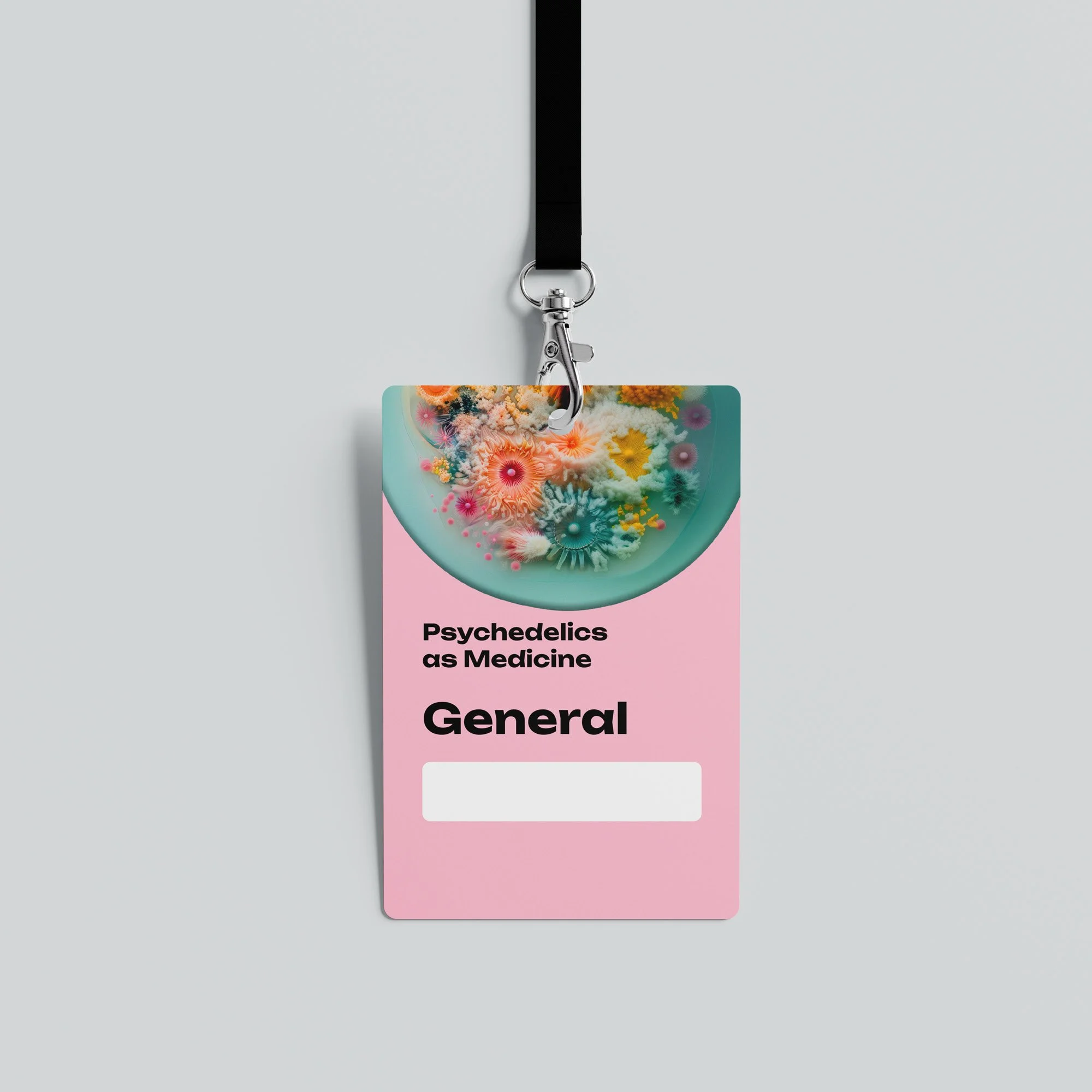
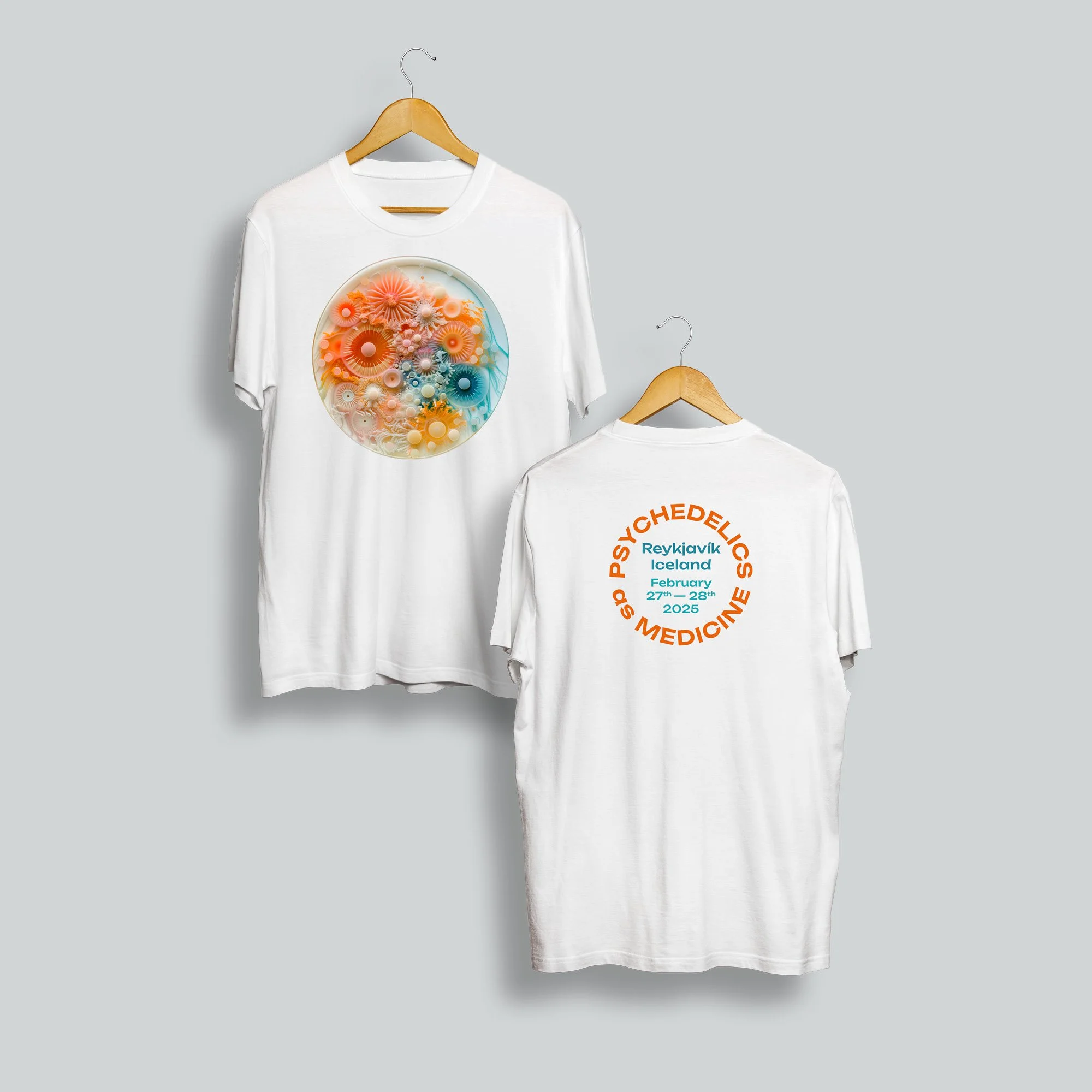
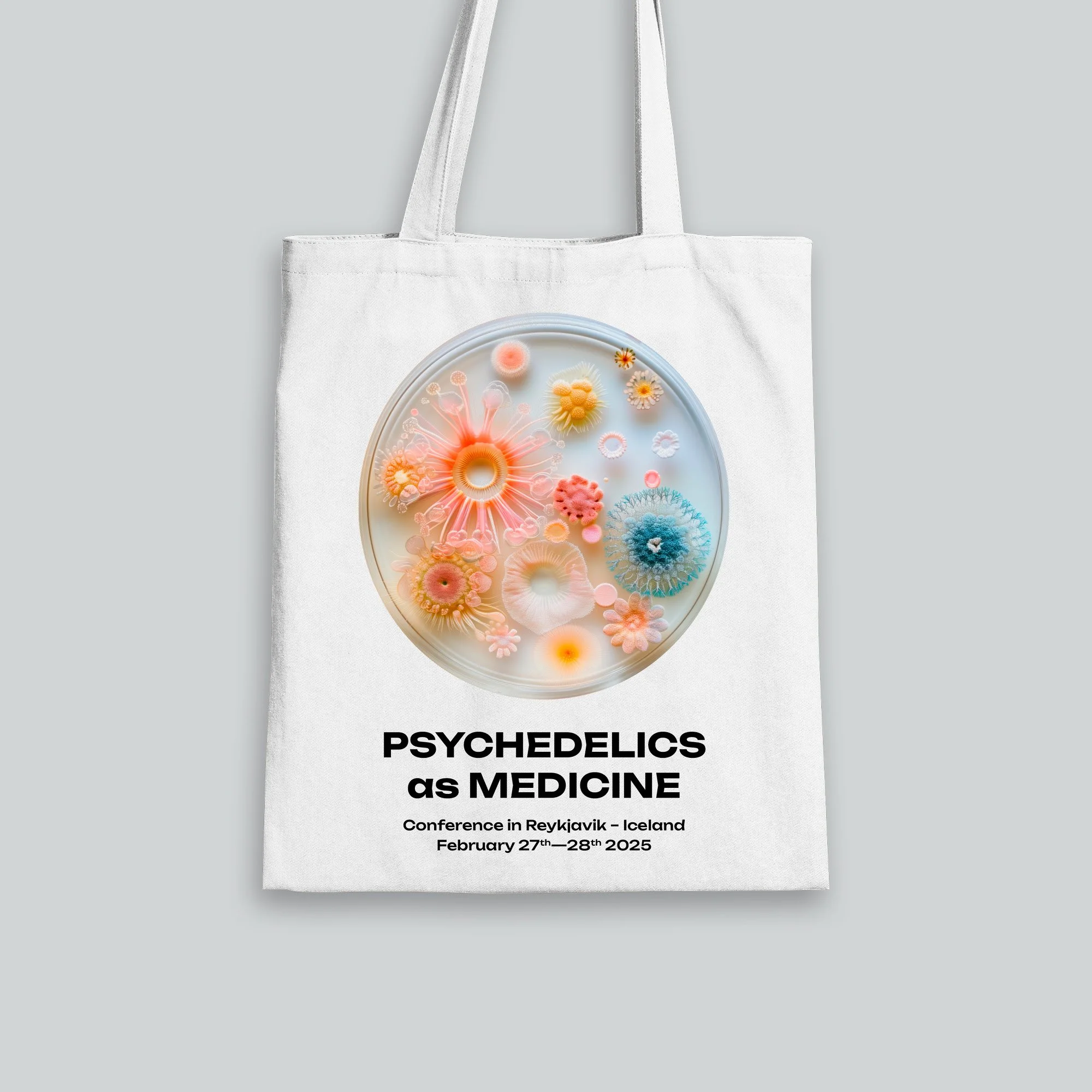
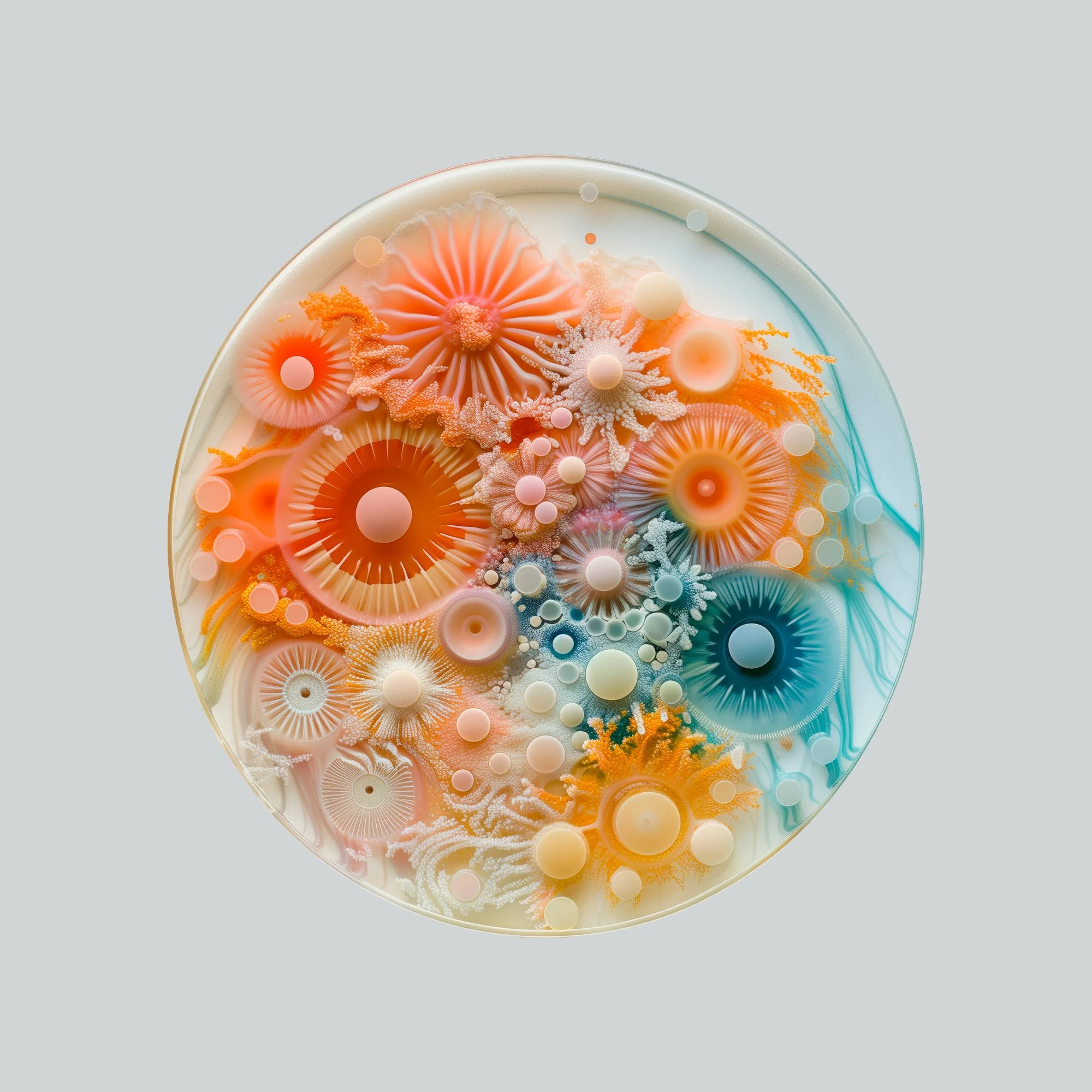
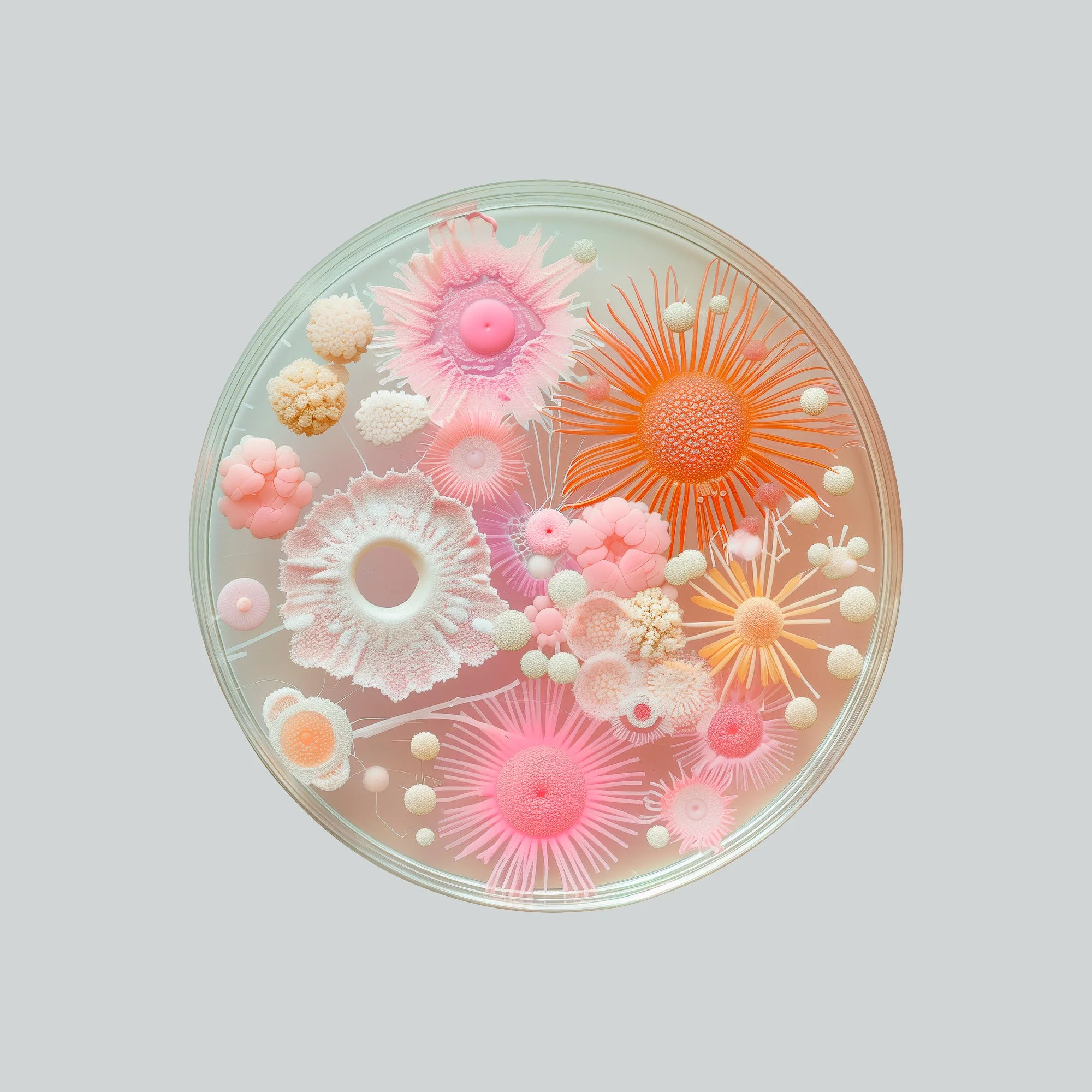
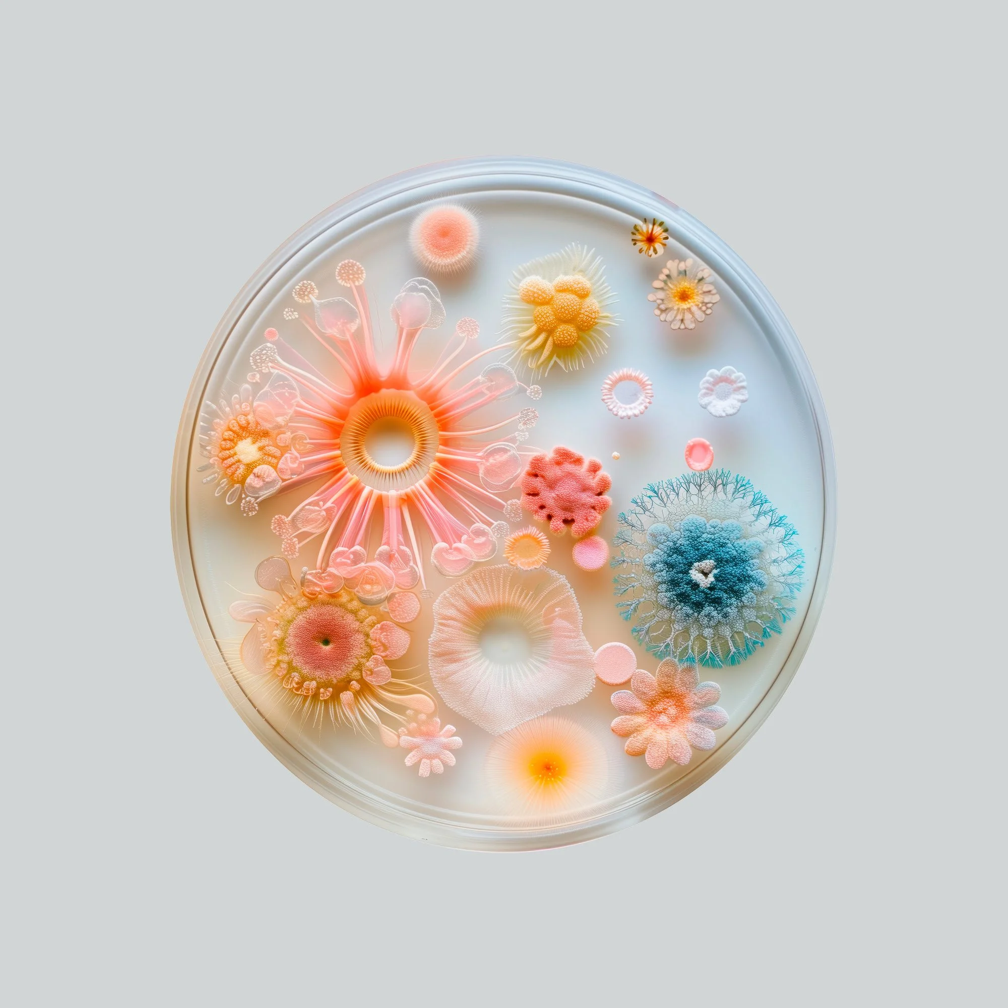
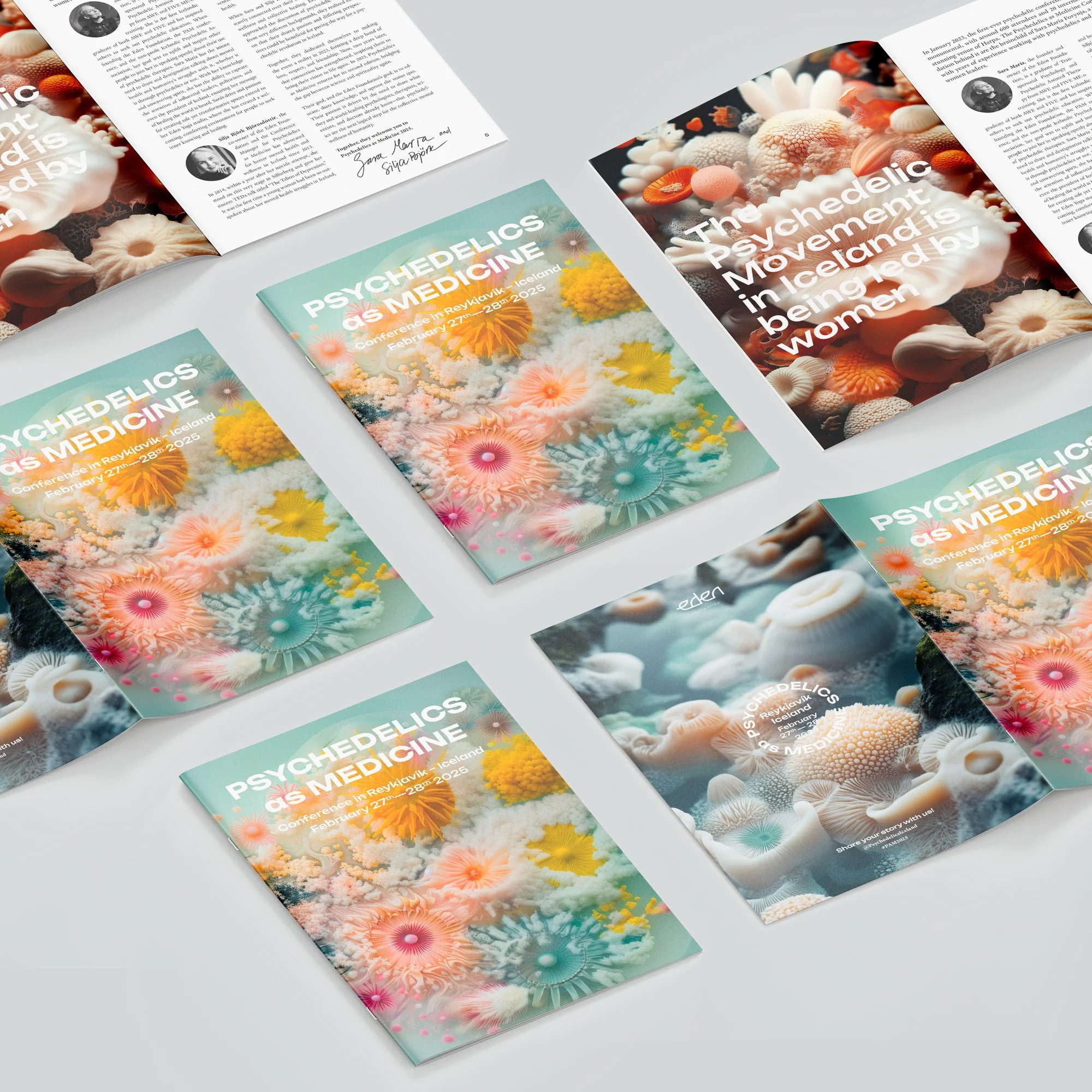
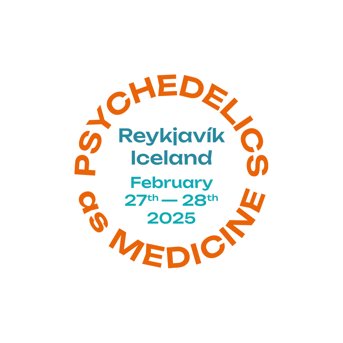
Visual Identity for Psychedelics as Medicine Conference
A conference identity for an event exploring psychedelics as medicine. The visual direction balanced scientific credibility with a more open, human, and exploratory feeling. Instead of leaning too heavily into psychedelic stereotypes, the design used color, rhythm, and layered visual forms to suggest perception, research, healing, and altered states in a more refined way.
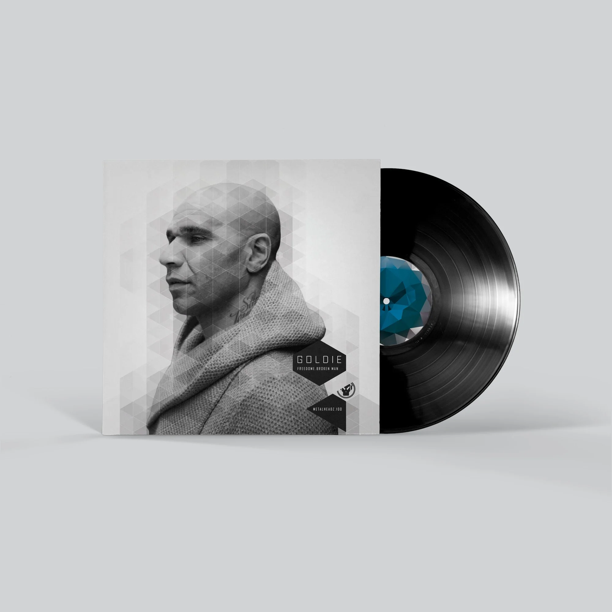
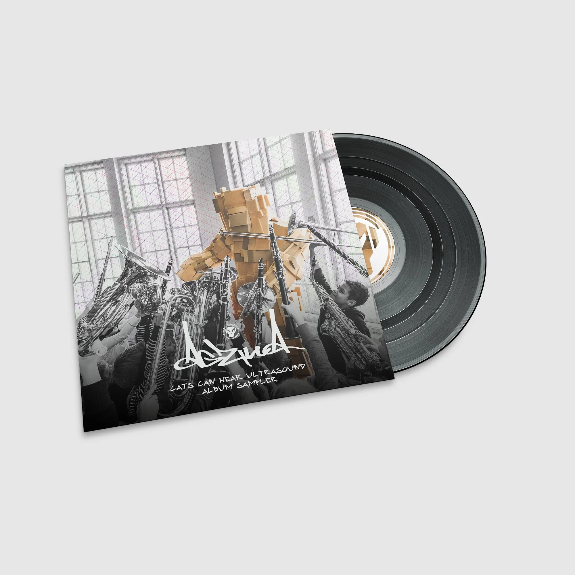
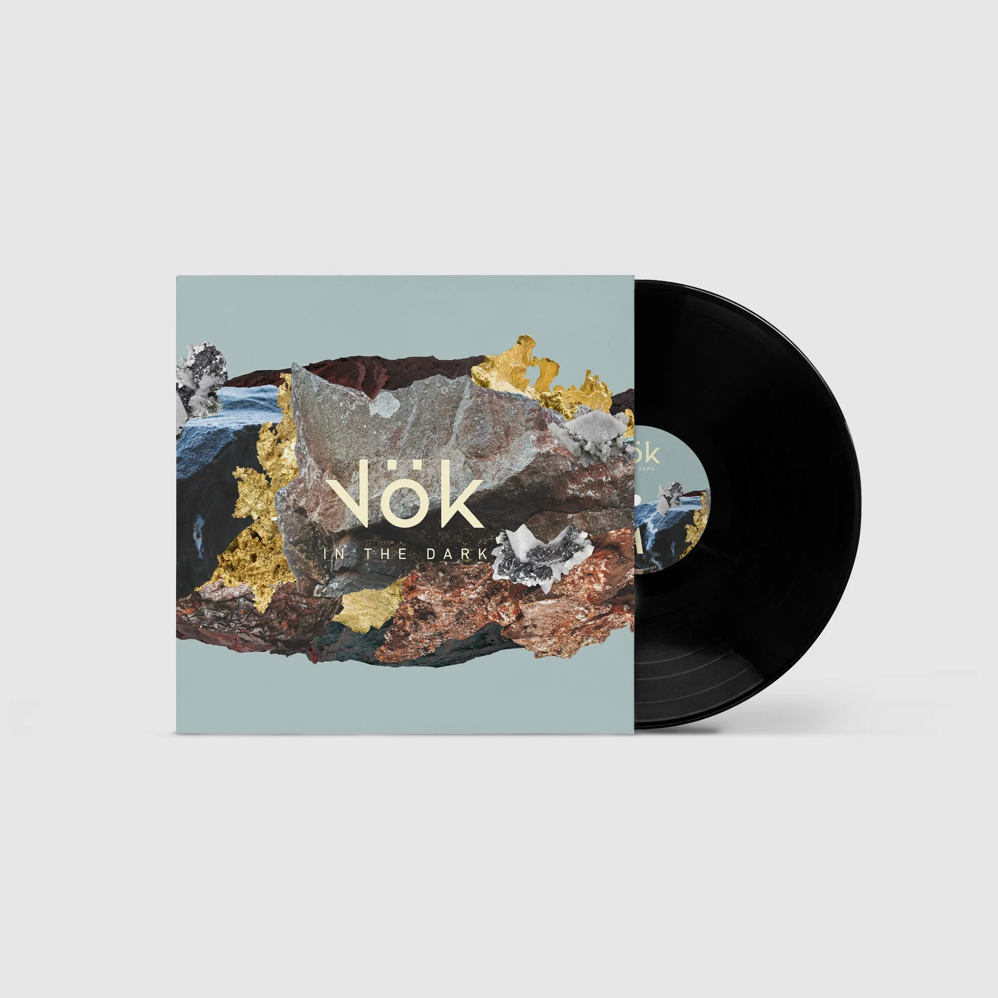
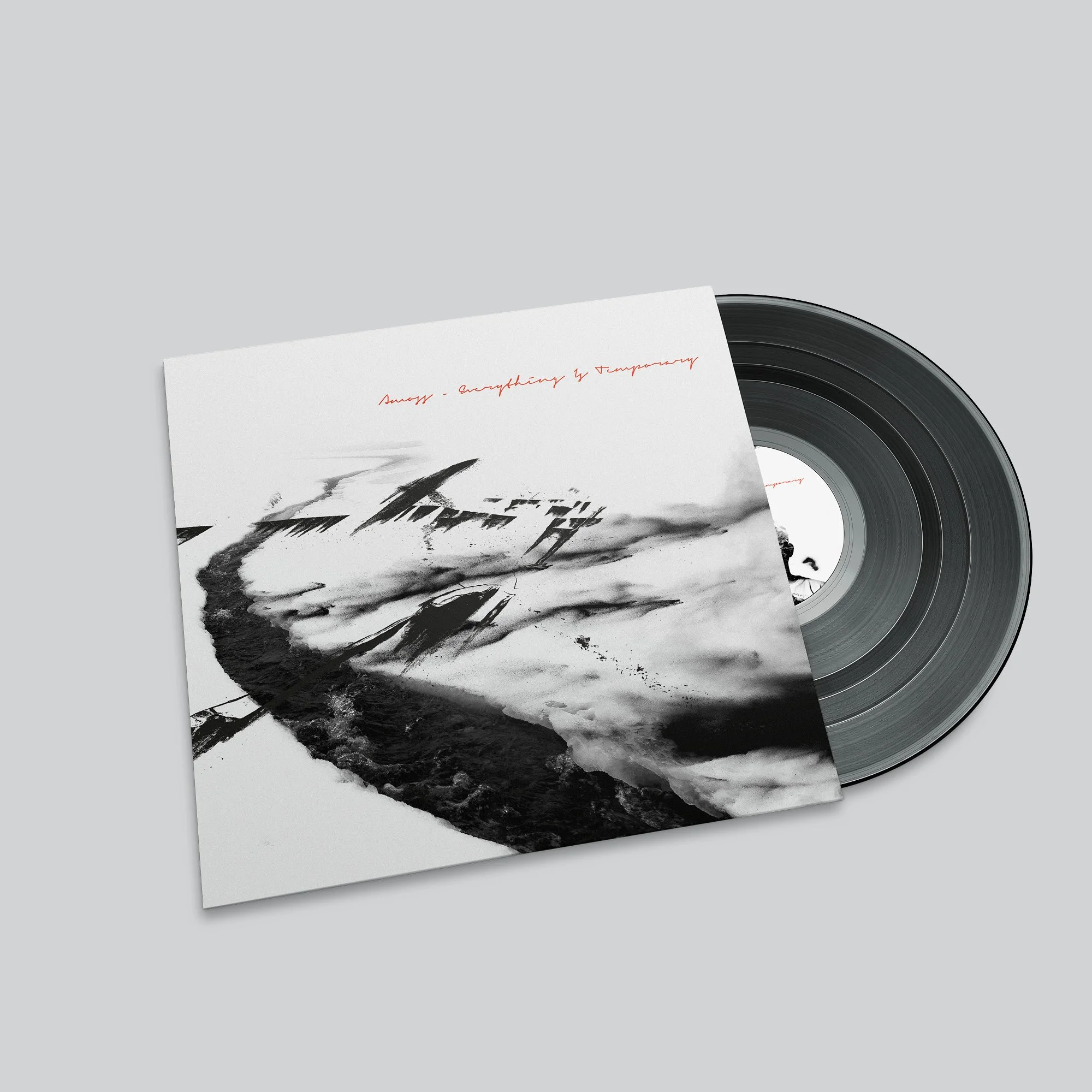
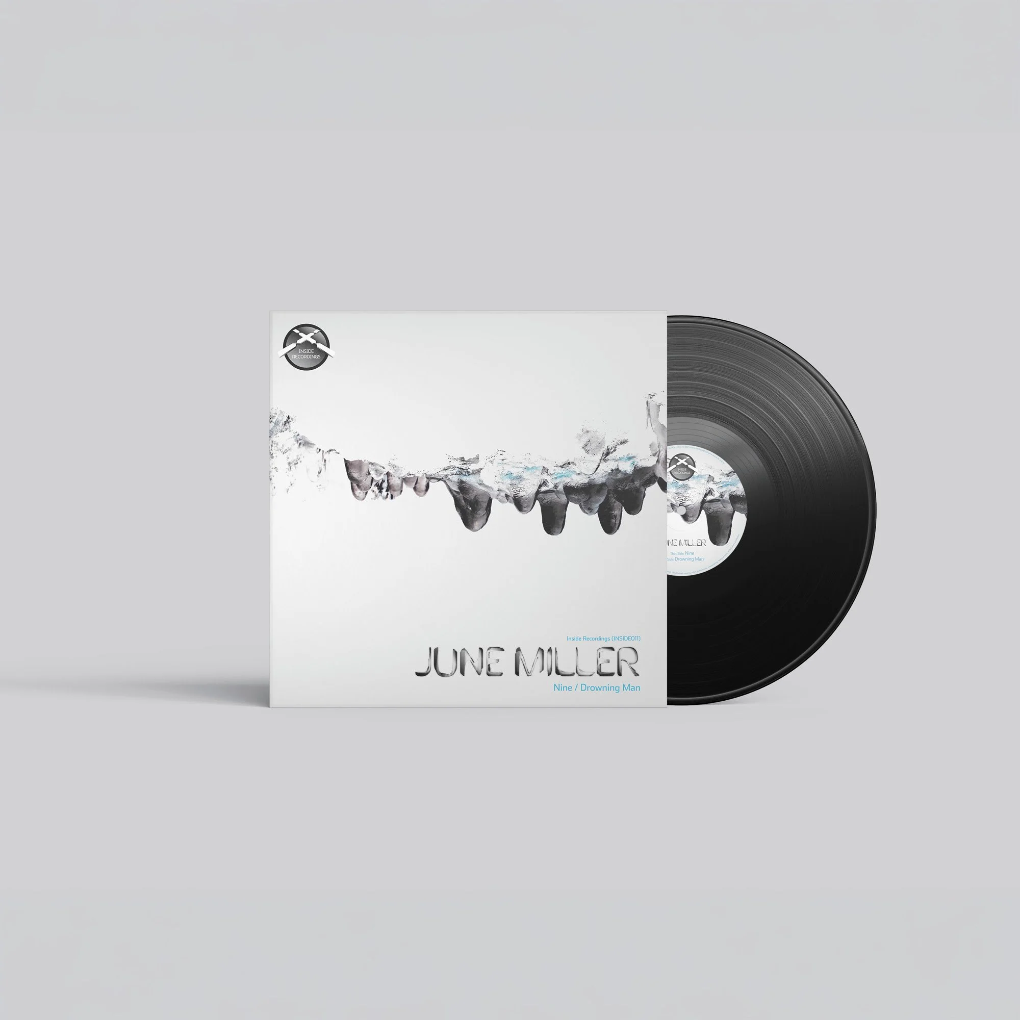
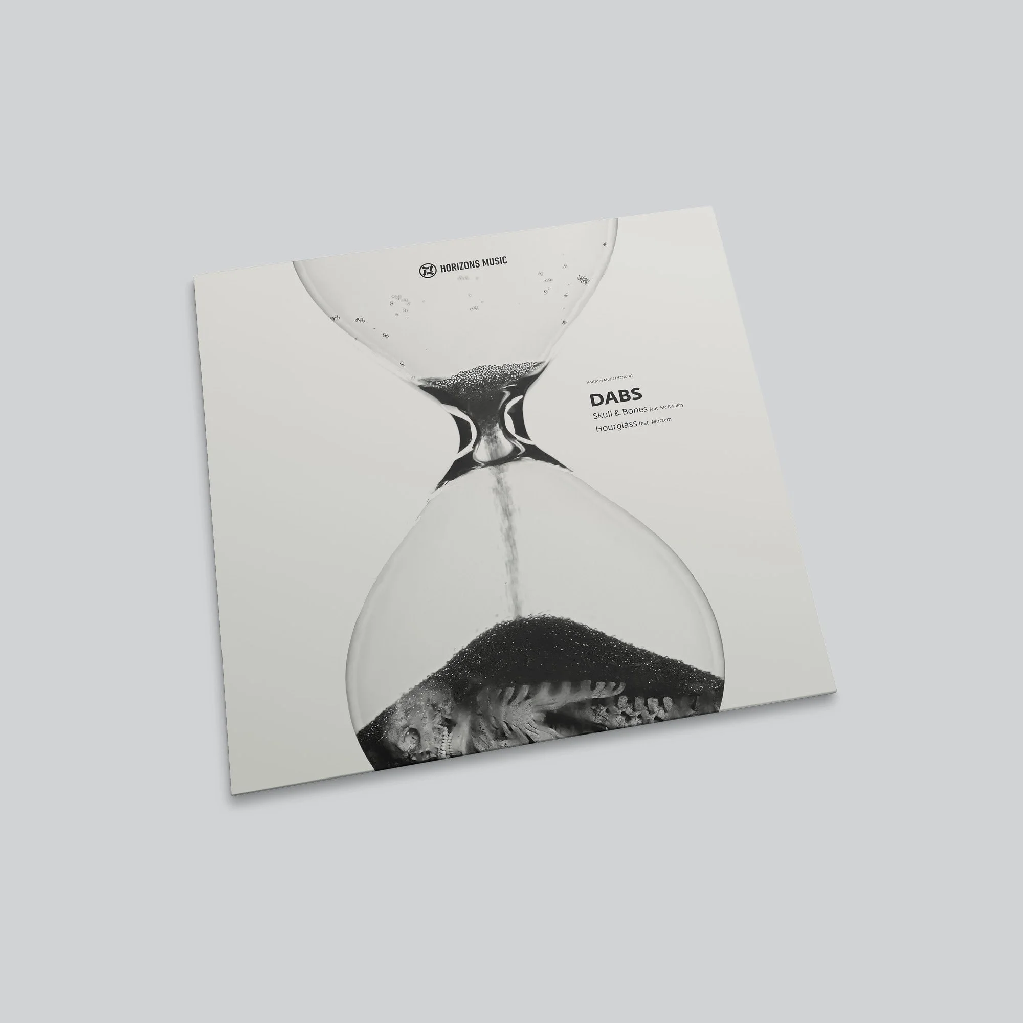
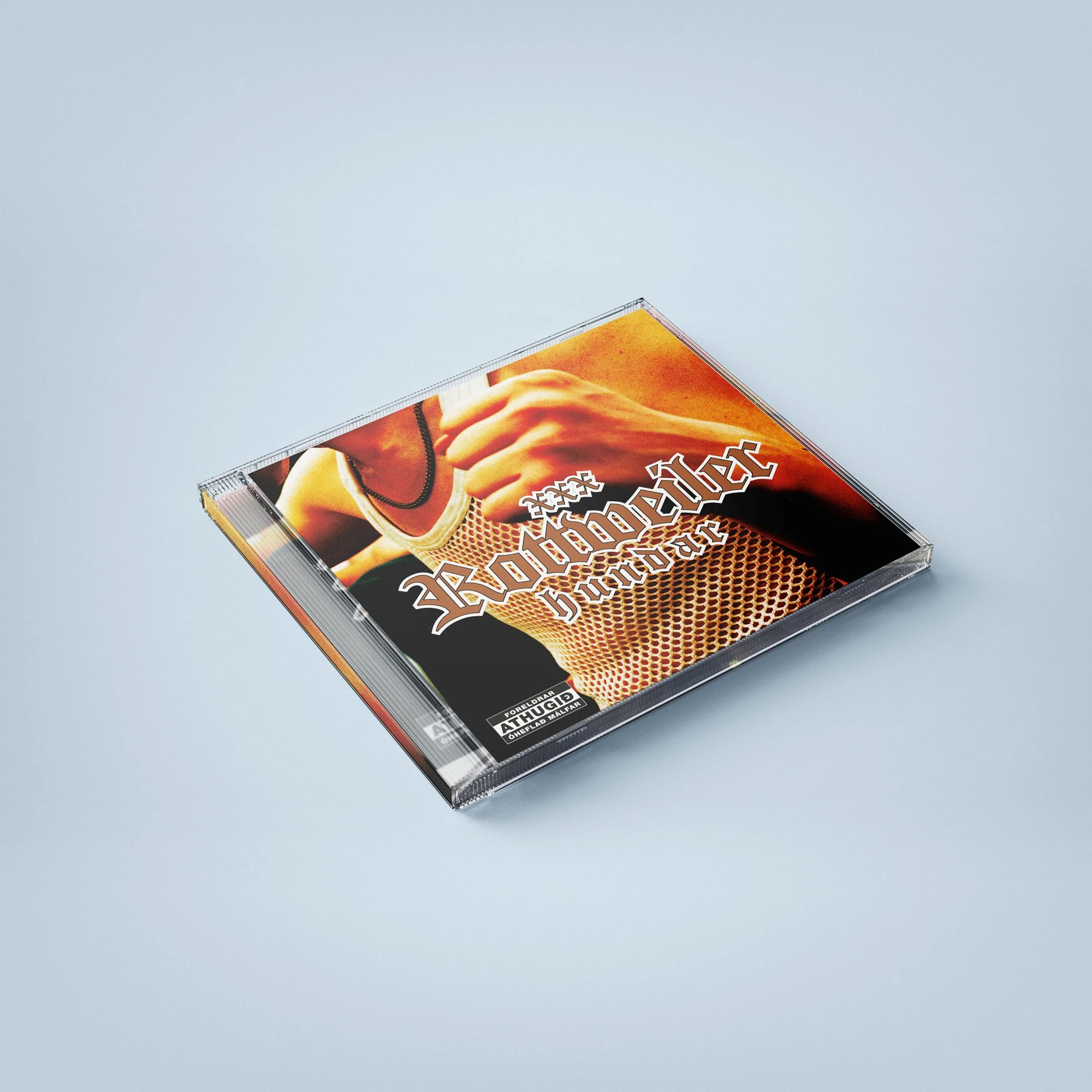
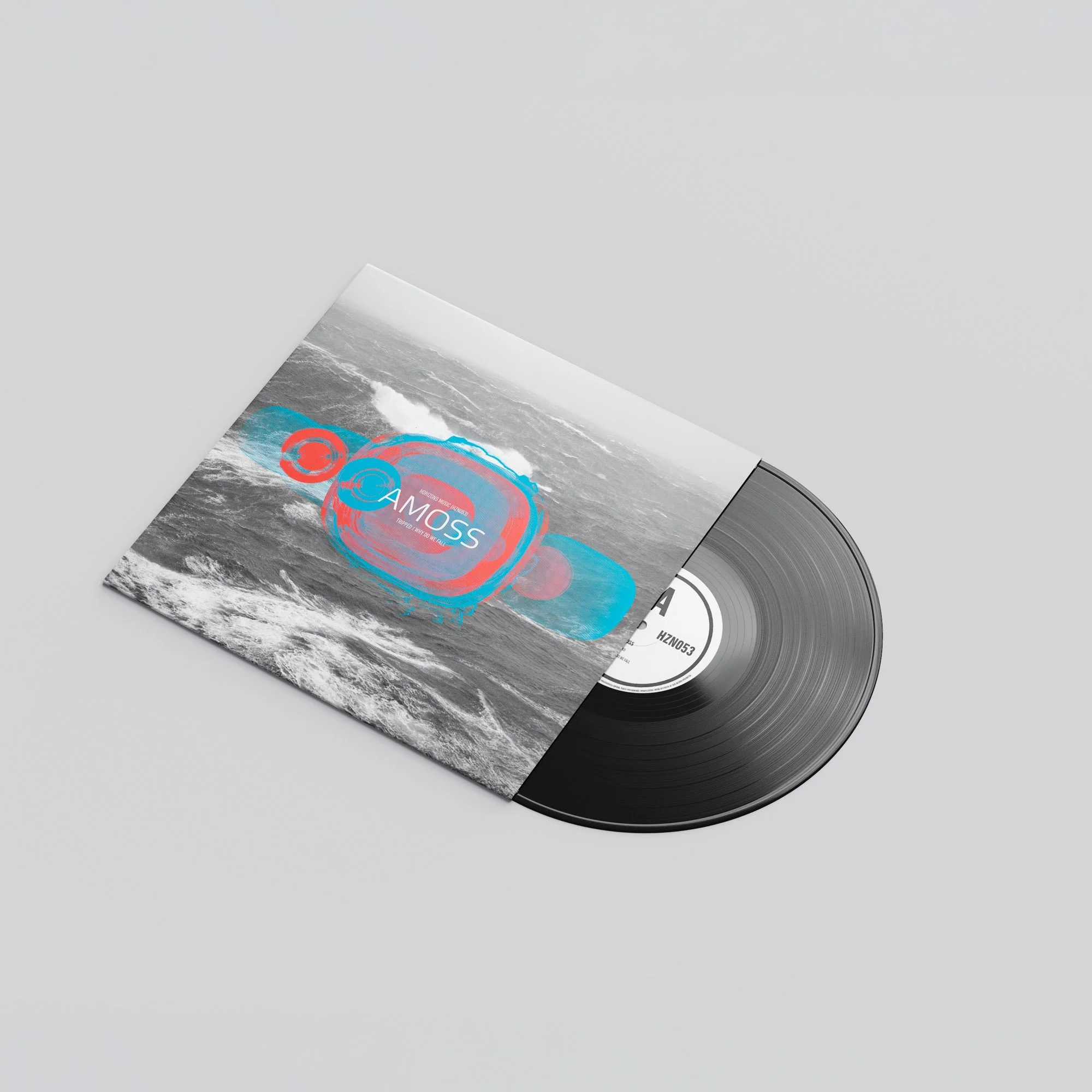
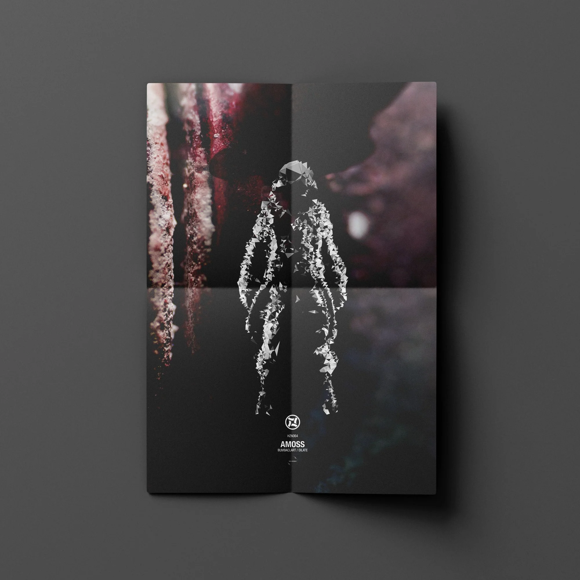
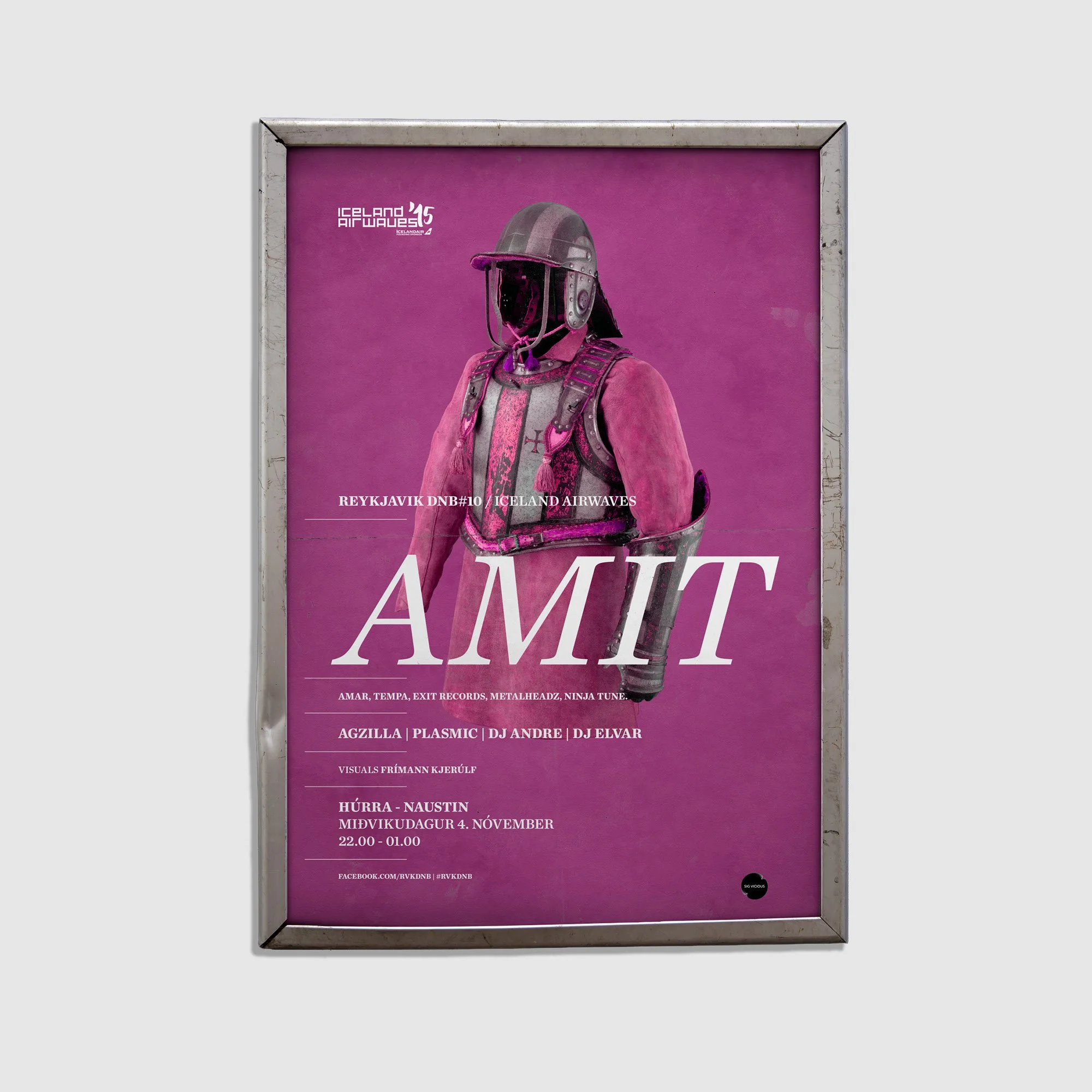
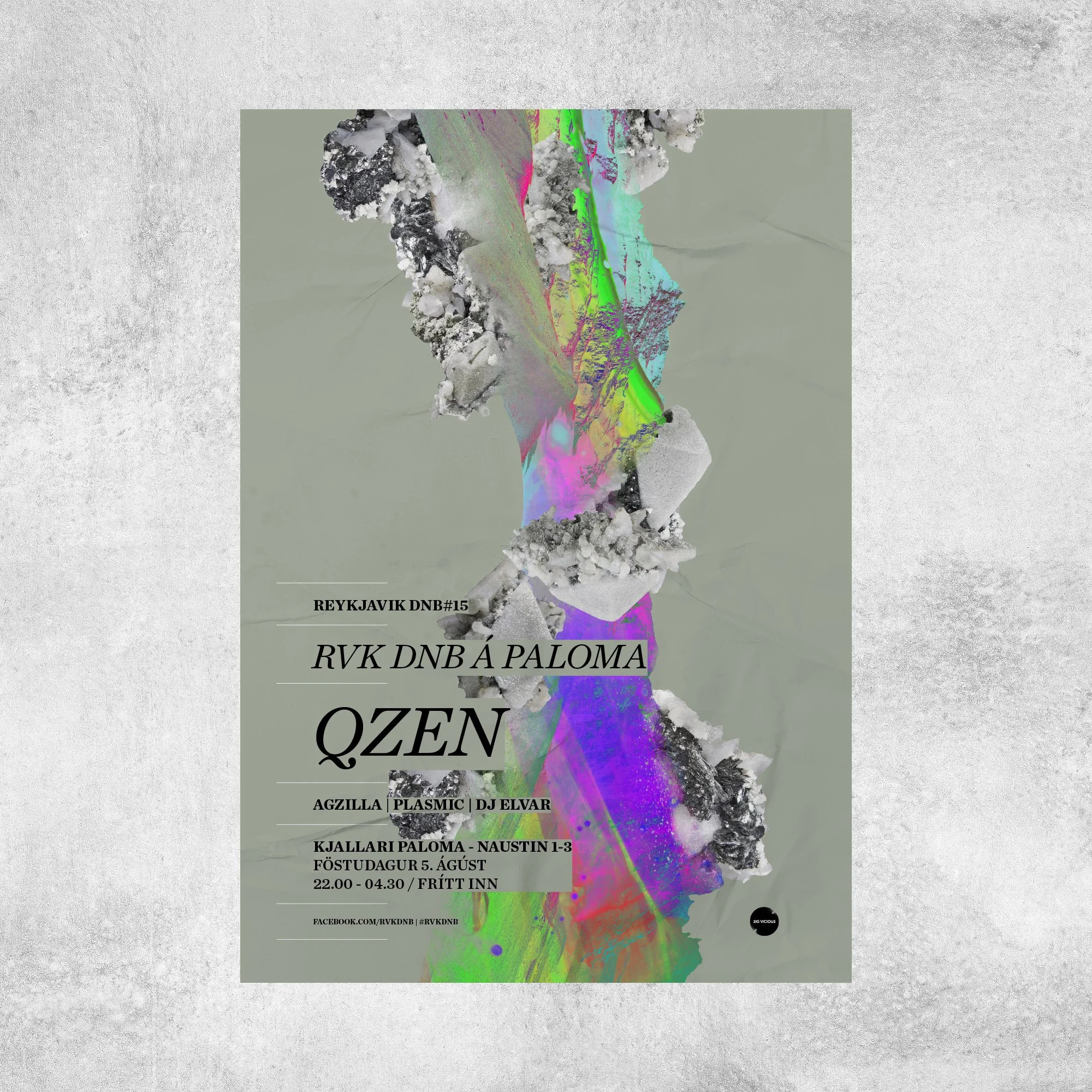
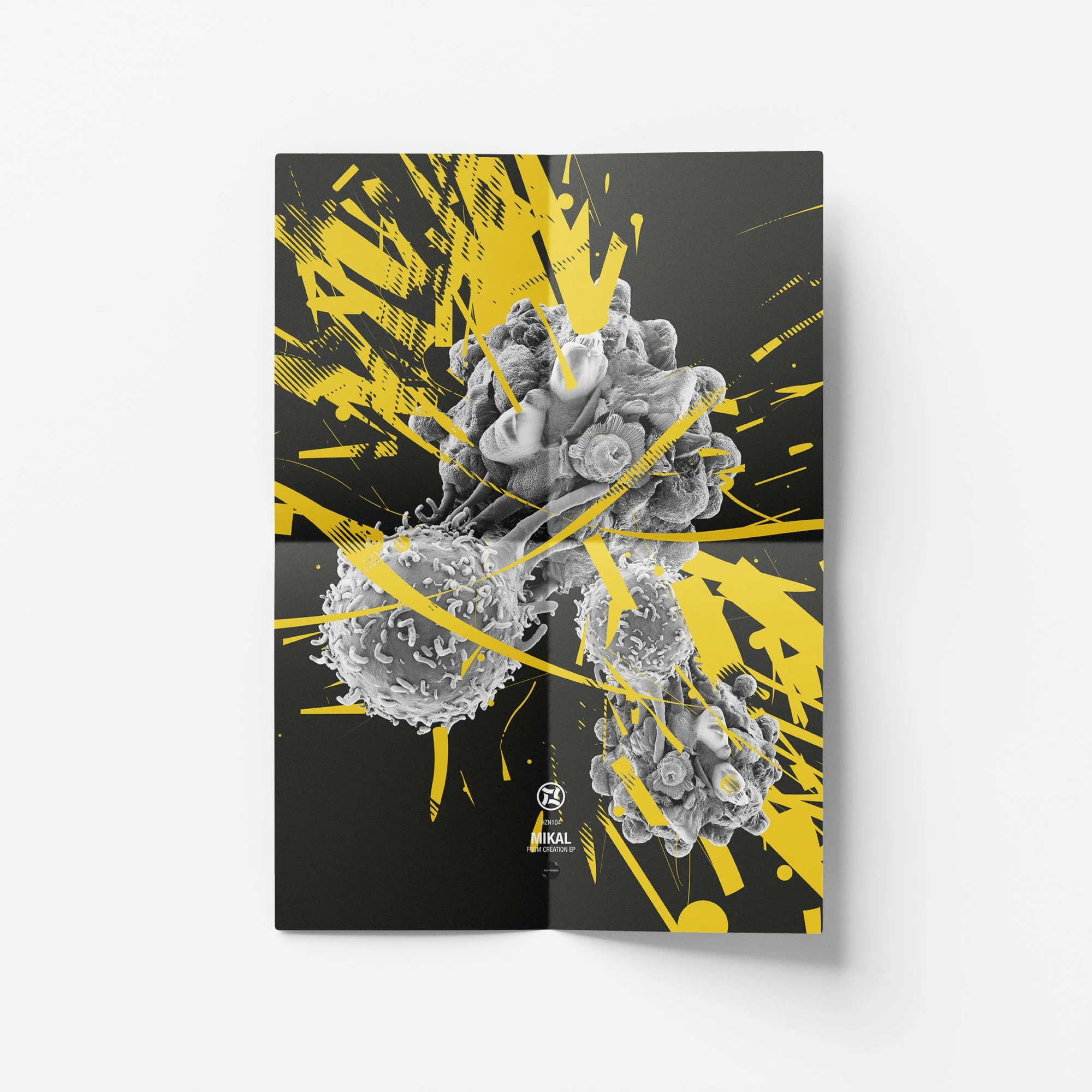
Music Covers and Posters
A selection of music-related design work, including album covers, single covers, posters, and promotional material. These projects often start with the sound, mood, or personality of the artist and turn that into a visual language. The work moves between typography, photography, illustration, texture, and layout, with each piece designed to feel specific to the music rather than follow a fixed house style.
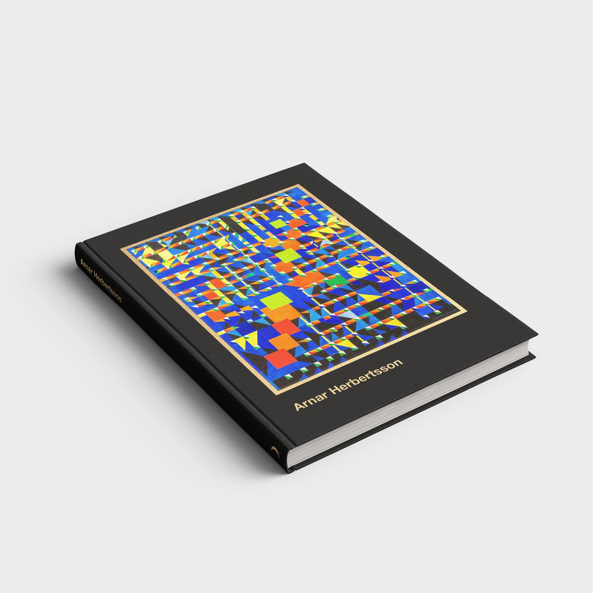
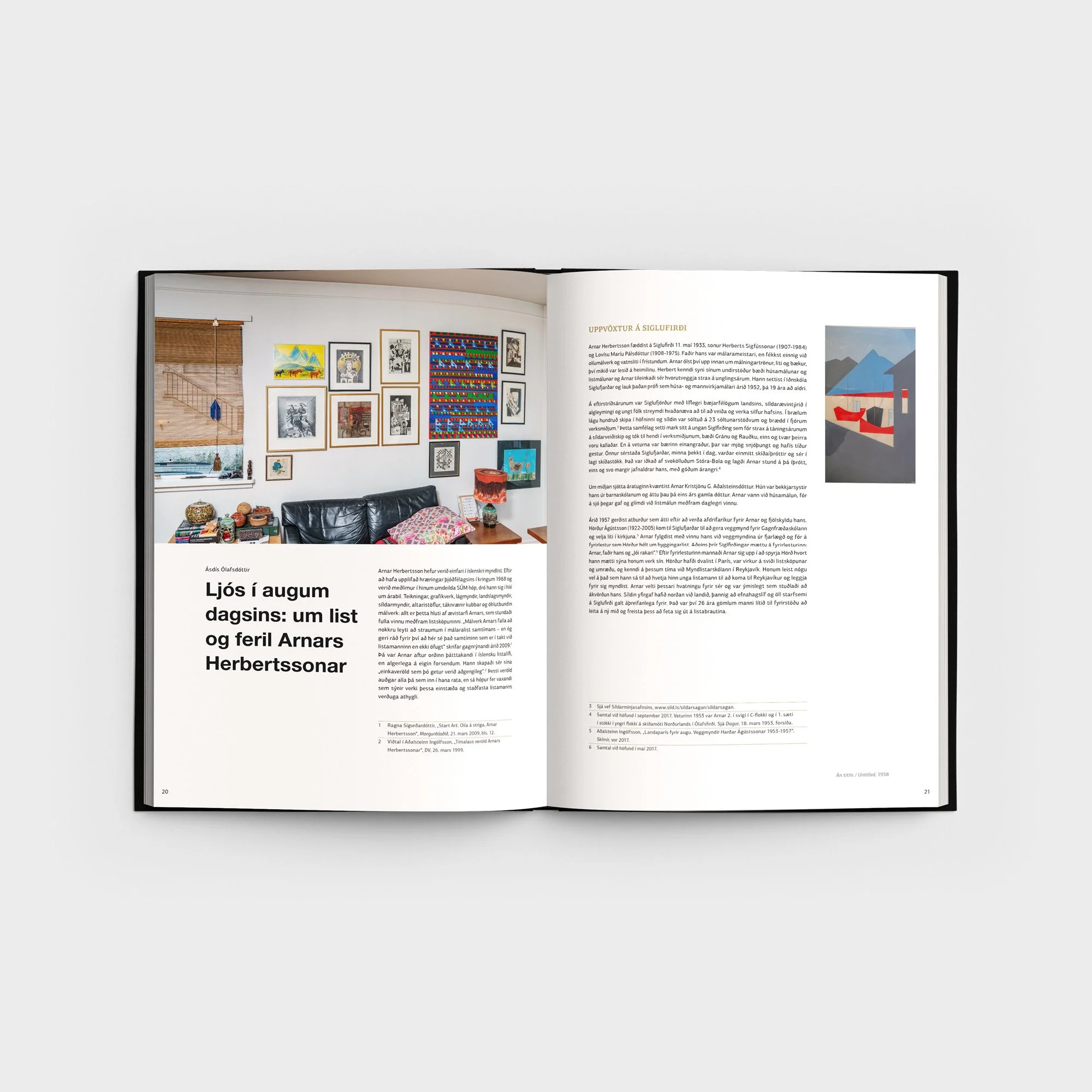
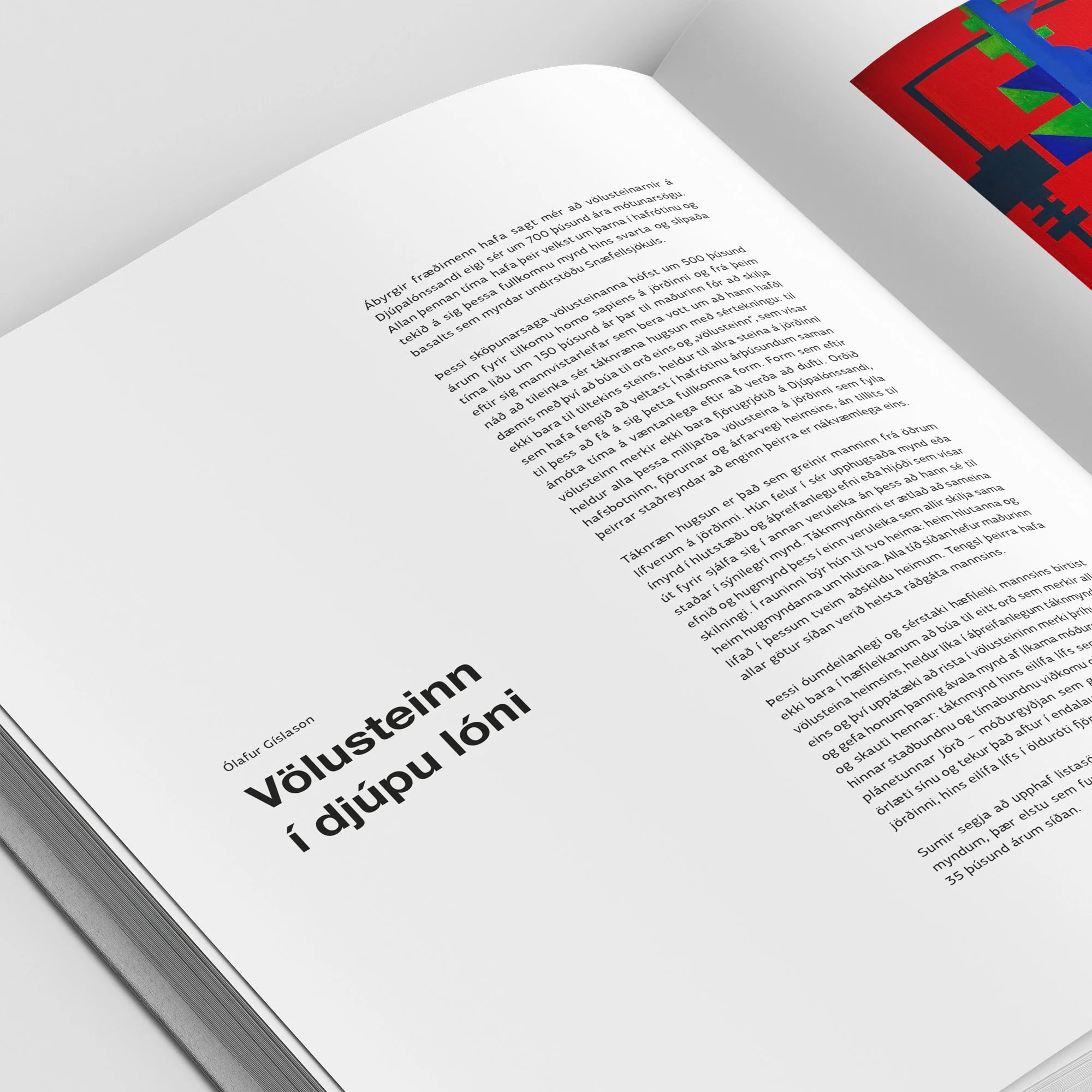
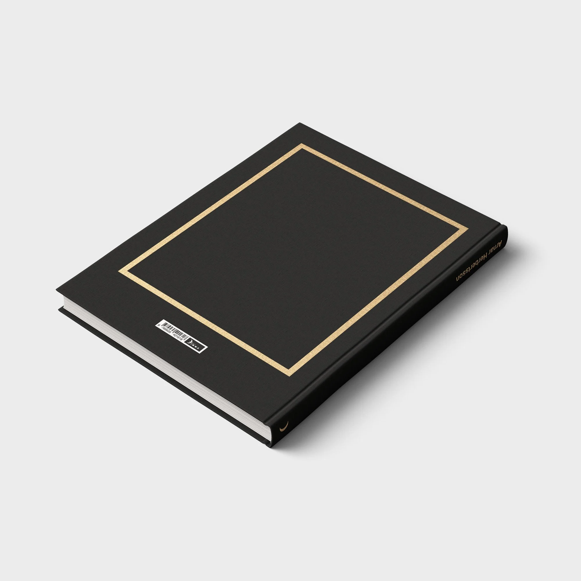
Arnar Herbertsson Artist Book
A book documenting the 50-year career of Icelandic artist Arnar Herbertsson. The project required a careful balance between design, structure, and respect for a long creative life. The layout was built to give the artwork space to breathe while still creating a clear rhythm through the book. The design supports the archive, the story, and the visual development of the artist over five decades.
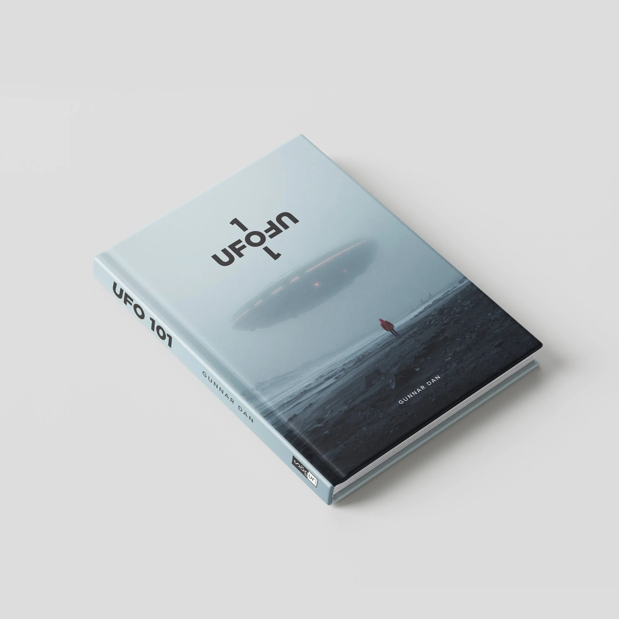
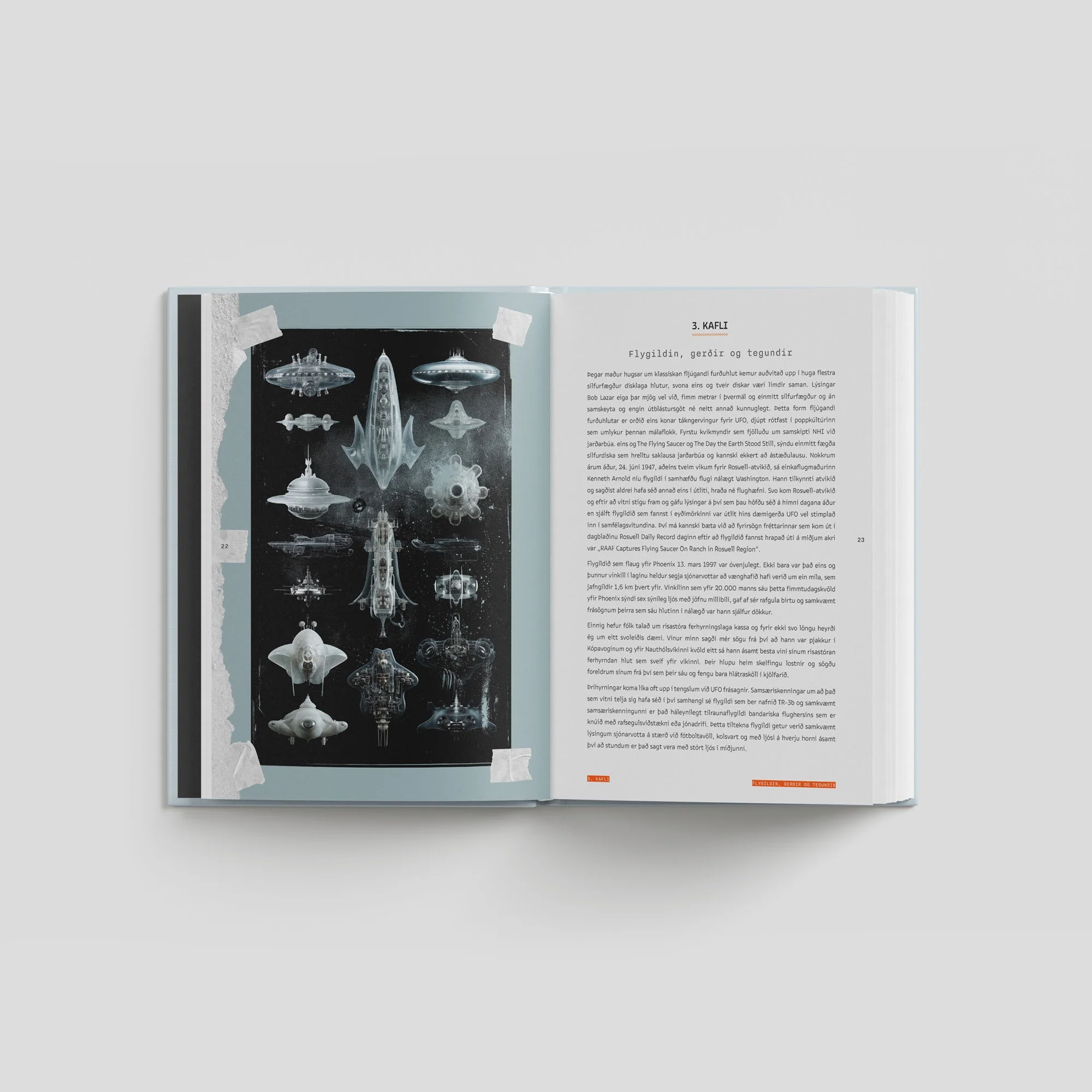
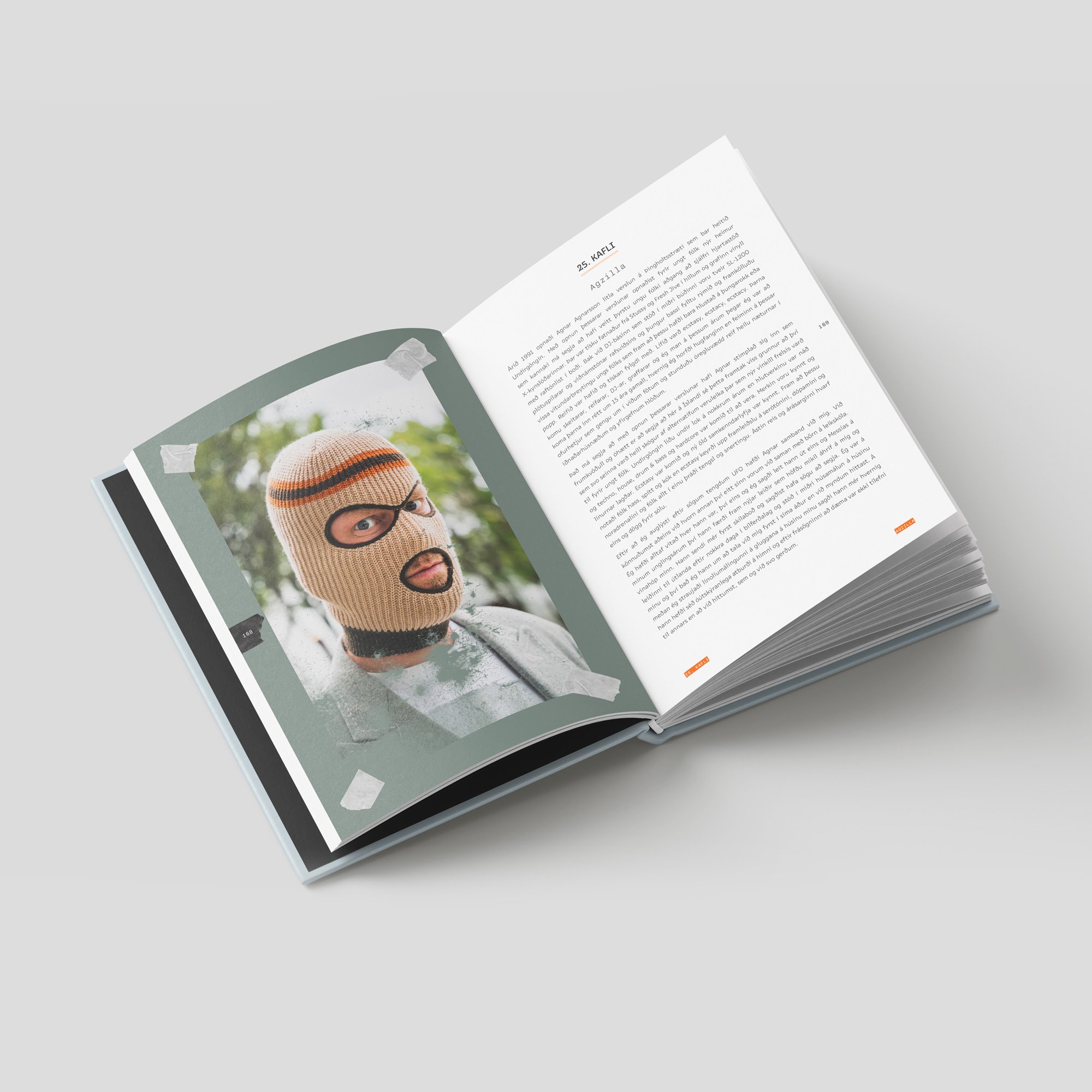
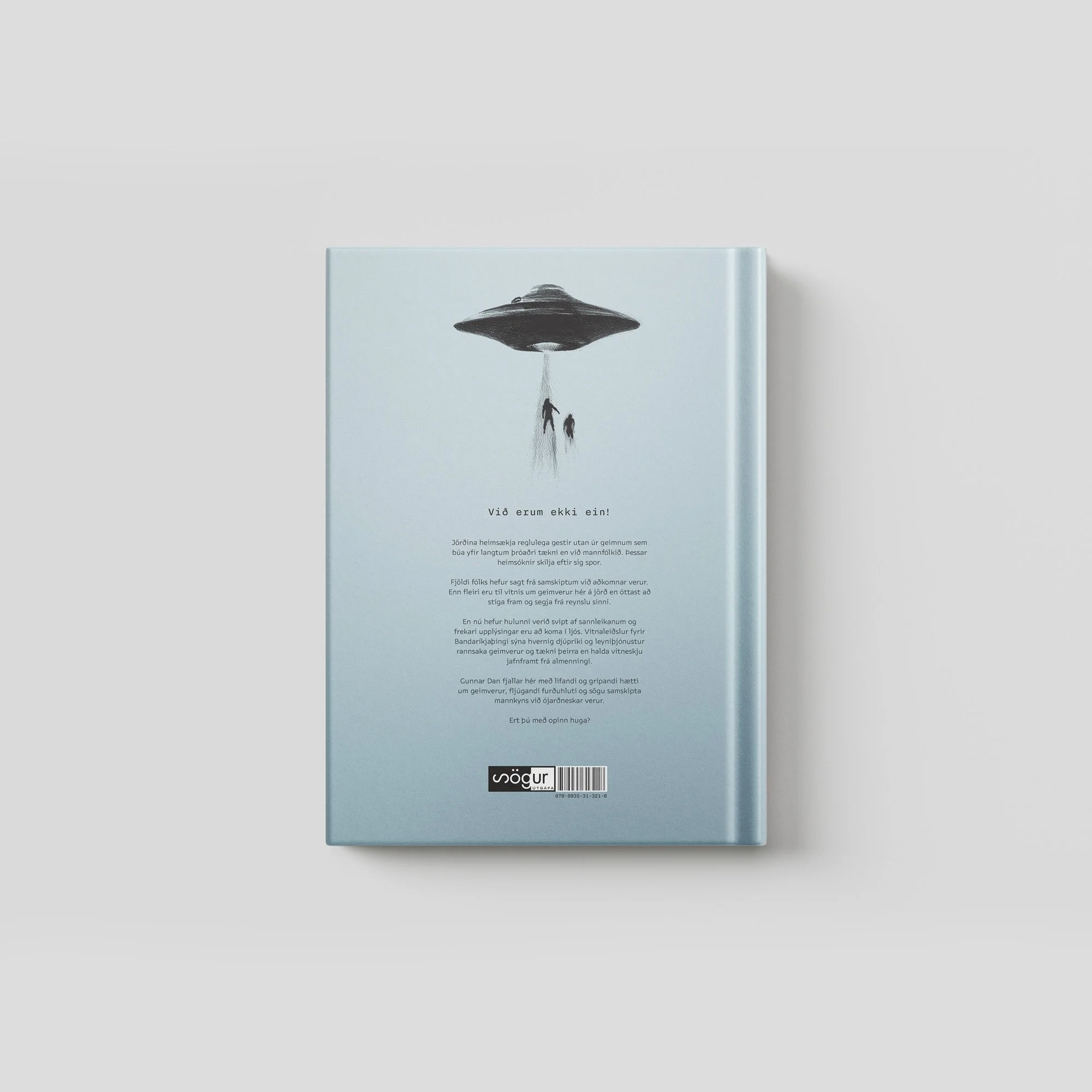
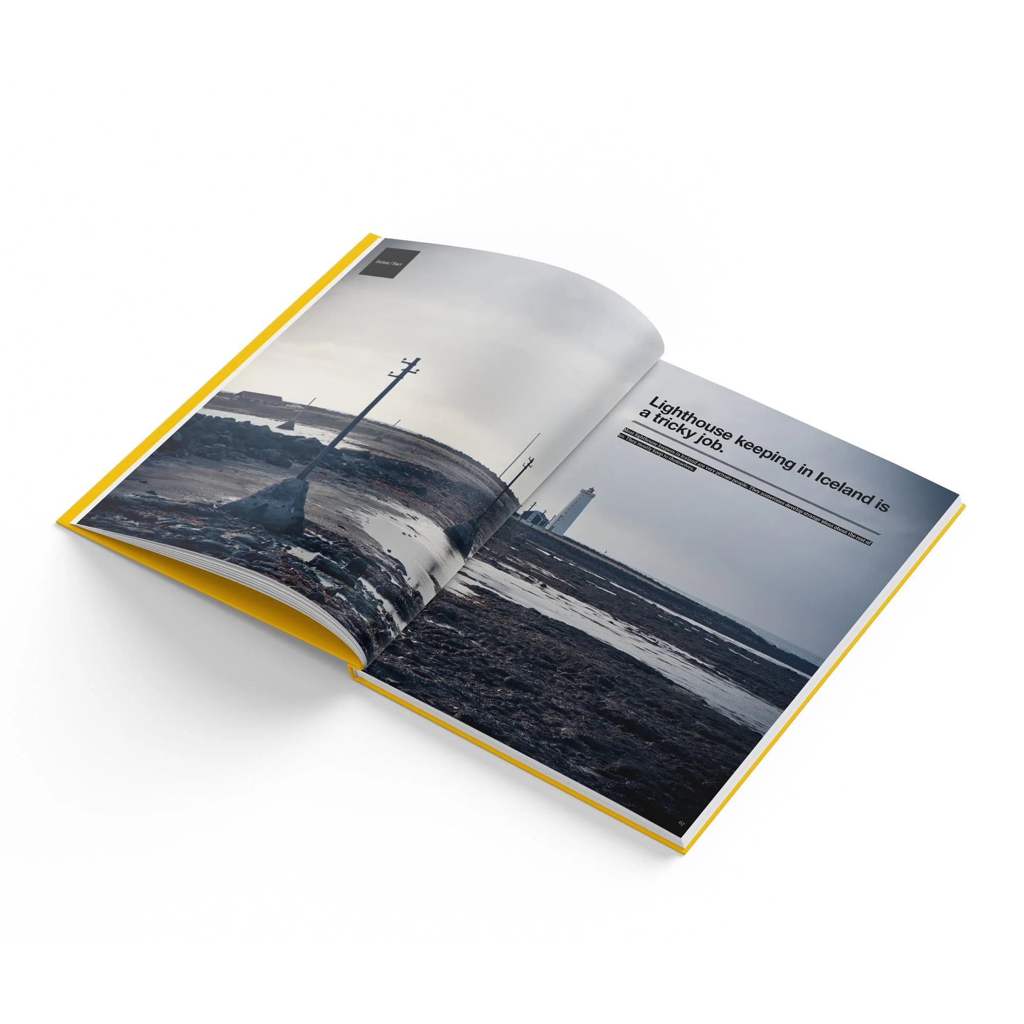
UFO 101
A book project focused on UFO sightings in Iceland. The subject called for a visual approach that could sit somewhere between documentation, mystery, folklore, and atmosphere. The design uses typography, pacing, image treatment, and layout to create a sense of curiosity without becoming overly theatrical. It treats the material with enough seriousness to feel researched, while still allowing room for the strange and unexplained. UFO 202 is scheduled for release in late fall 2026.
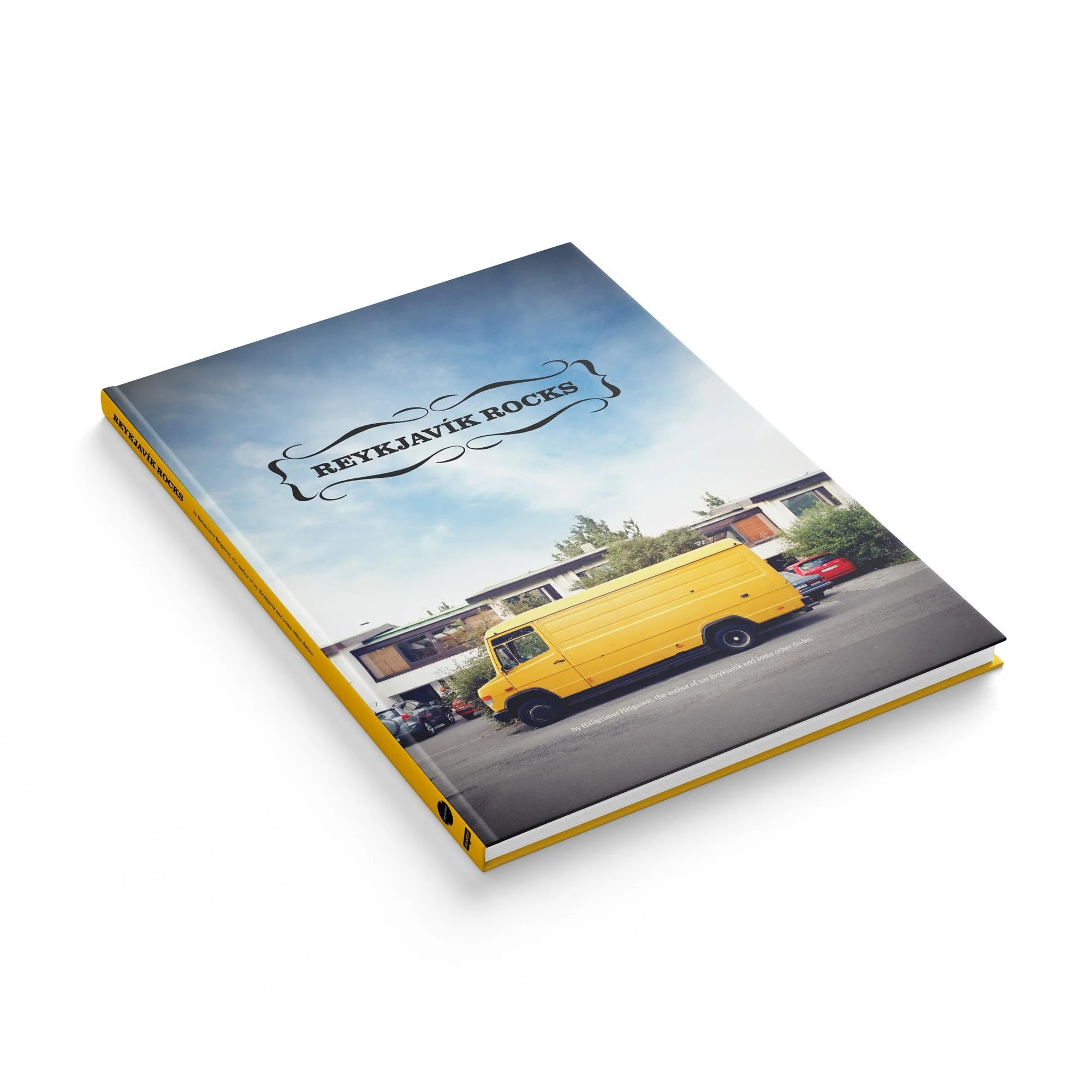
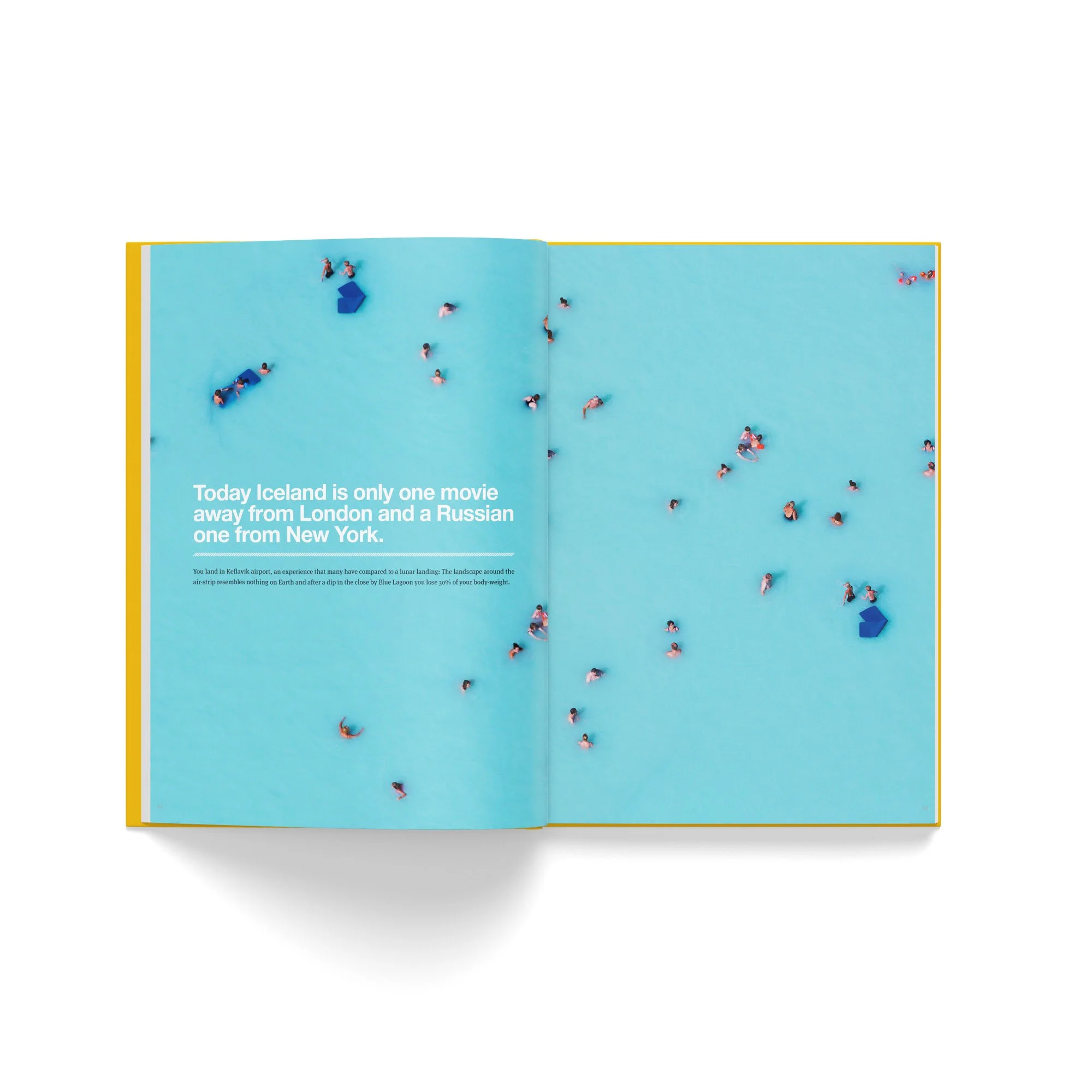
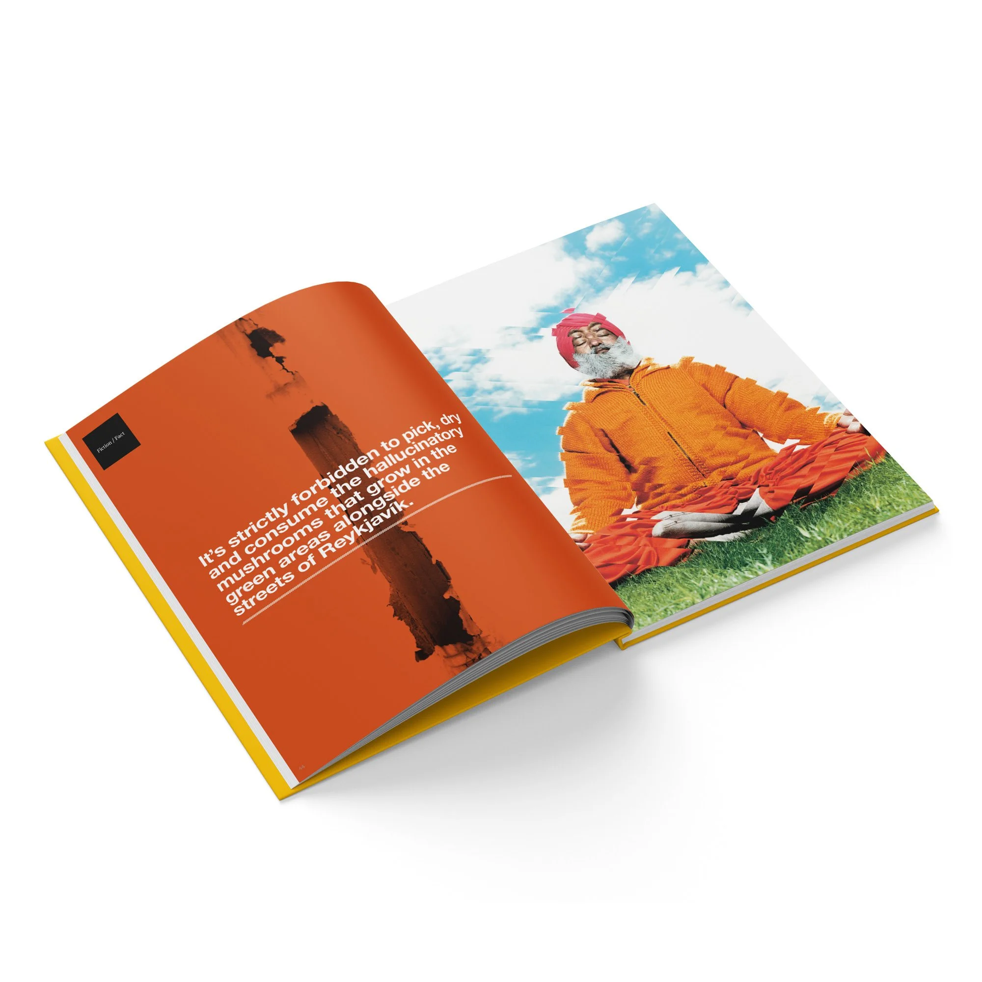
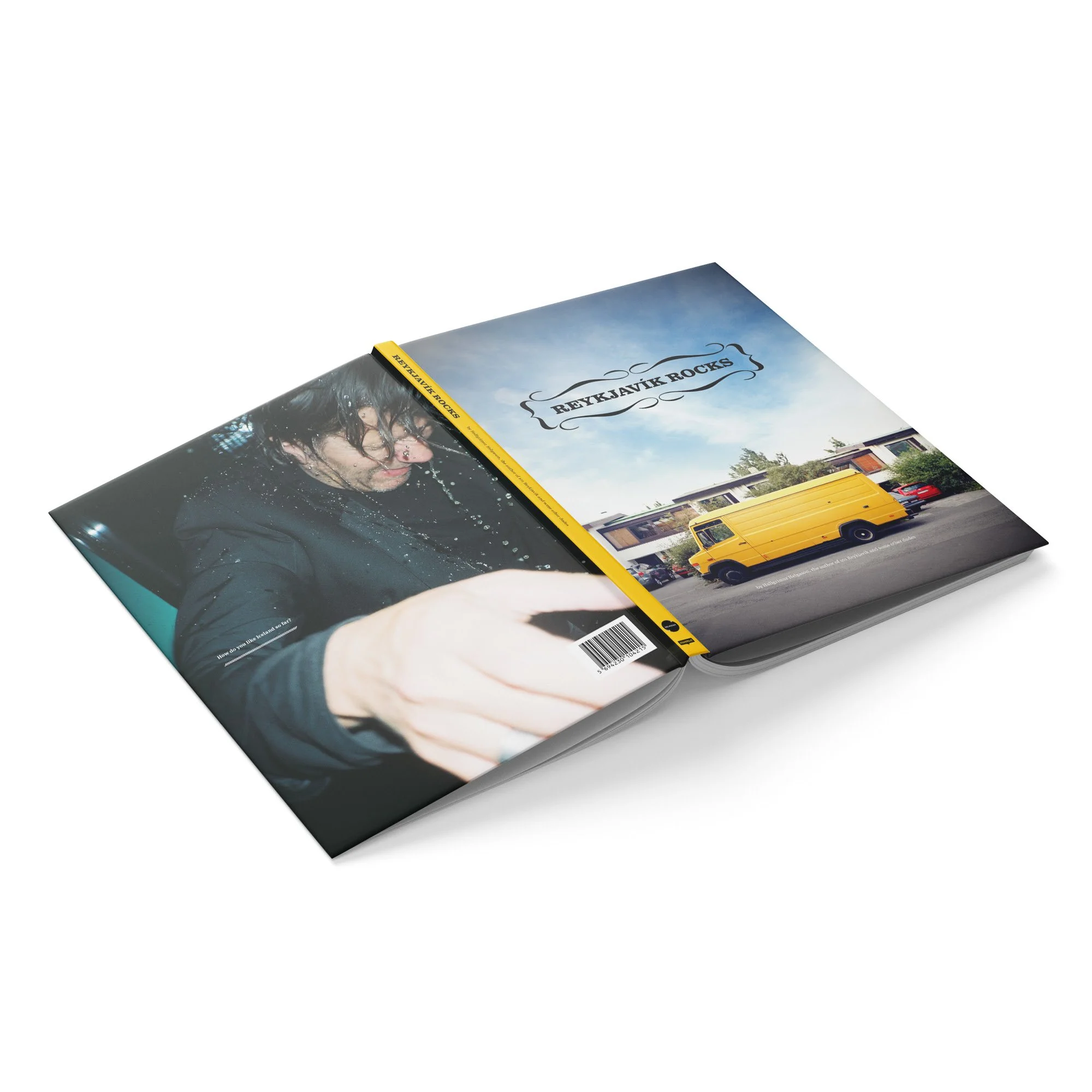
Reykjavik Rocks
A book design project for Reykjavik Rocks, a humorous insider’s guide to Reykjavík, written by Hallgrímur Helgason, Örn Úlfar Sævarsson, and Jón Atli Jónasson, with a foreword by then-mayor Jón Gnarr. The book set out to capture the creative, messy, funny, and constantly shifting energy of Reykjavík, the smallest big city in the world.
The design had to support that tone: informal, lively, image-driven, and full of character. Built around photography from some of Iceland’s most exciting young photographers, the layout gives the city room to feel raw, personal, and alive rather than polished into a tourist brochure. The result is a book that offers a peek inside the real Reykjavík: its people, humour, nightlife, art, attitude, and strange little details.
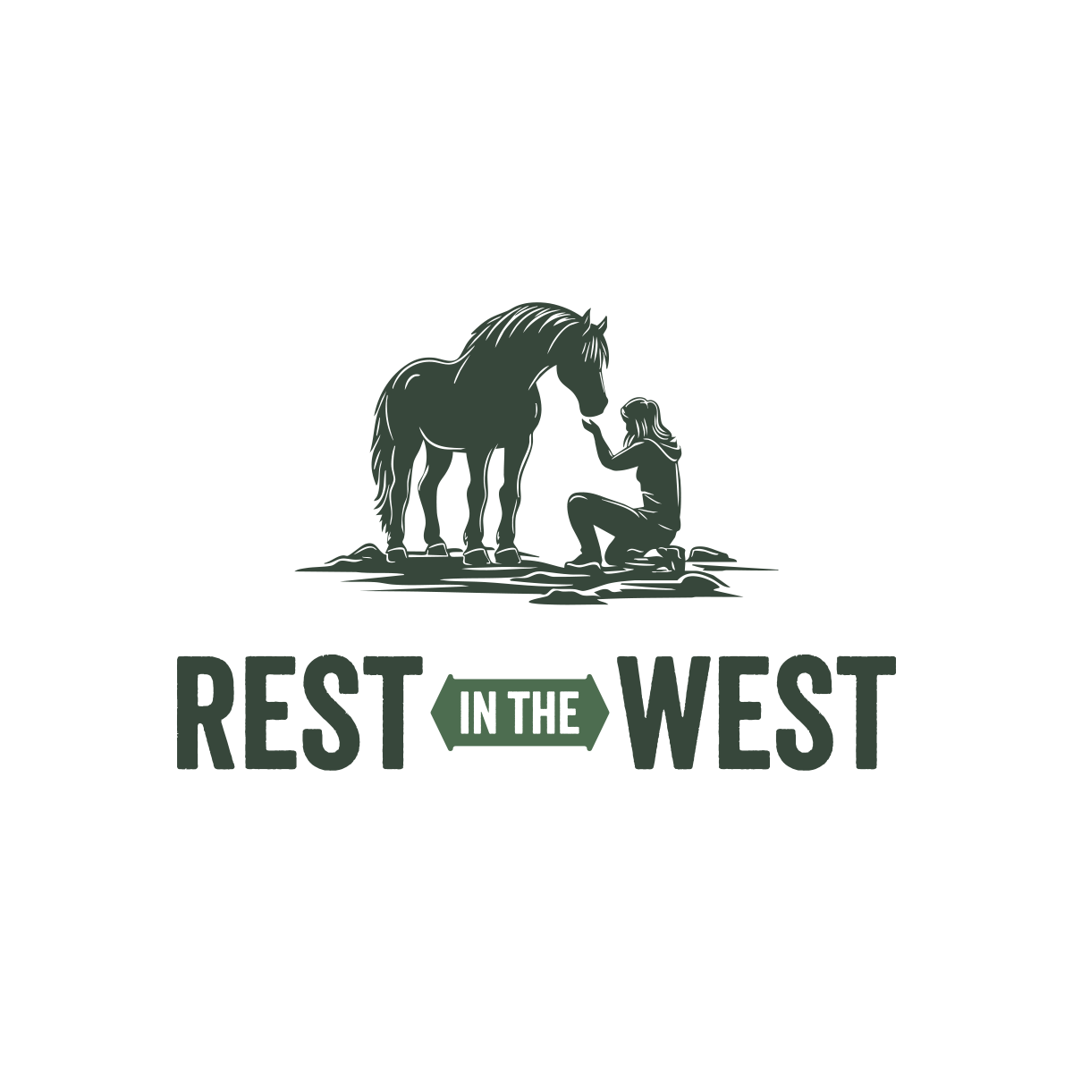
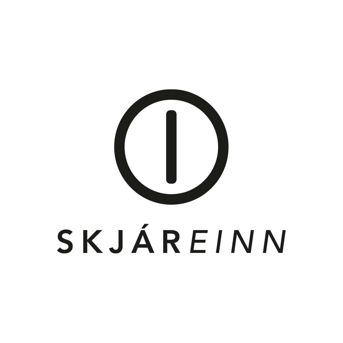
Logo Selection
A selection of logos designed over the past 20 years for companies, cultural projects, events, musicians, and organizations. The collection shows a range of approaches, from clean and functional marks to more expressive and character-driven identities.
Across the work, the focus is always on creating something memorable, usable, and appropriate for the client, whether the project calls for restraint, attitude, clarity, or personality.


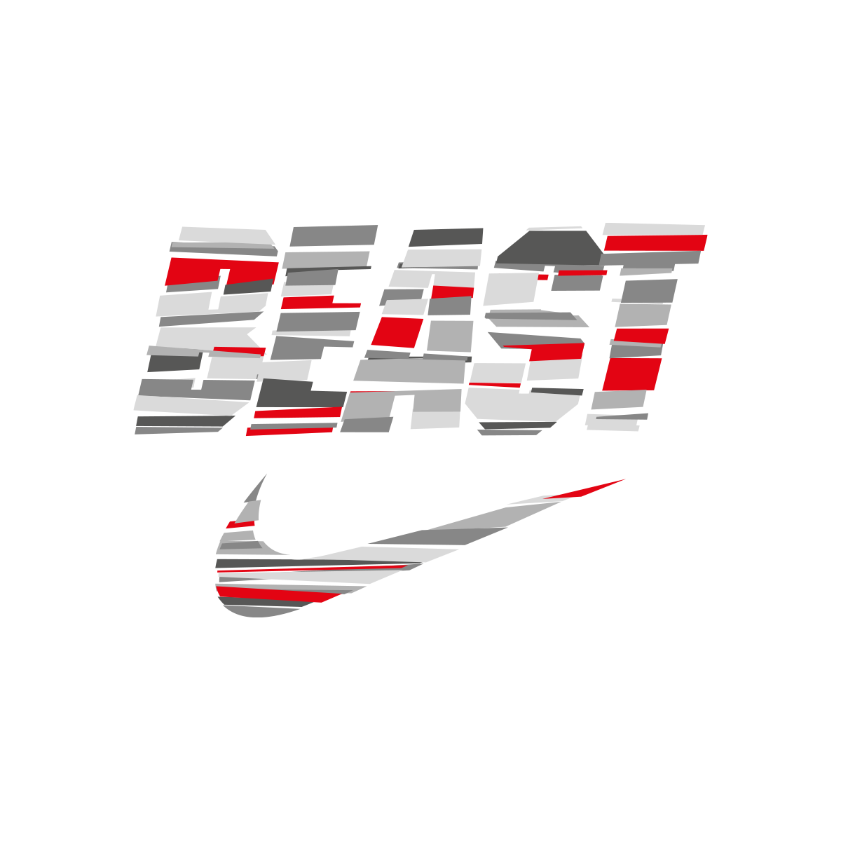


Broken Type
Broken Type began as a personal Illustrator experiment, exploring distorted letterforms, fragmentation, and controlled visual damage. What started as a self-initiated typographic study later developed into a commissioned style for Nike, where the same visual language was adapted for a new product lineup. The project sits somewhere between typography, illustration, and image-making, turning broken structure into a recognizable graphic system.


Disorder Type
Disorder Type started as an experimental typographic style built around disruption, movement, and visual tension. The work was later commissioned by Wired and adapted for use in a magazine issue. The project explores how type can carry energy and instability while still functioning as a designed visual element. It reflects an ongoing interest in pushing typography beyond clean communication and into something more expressive, physical, and strange.


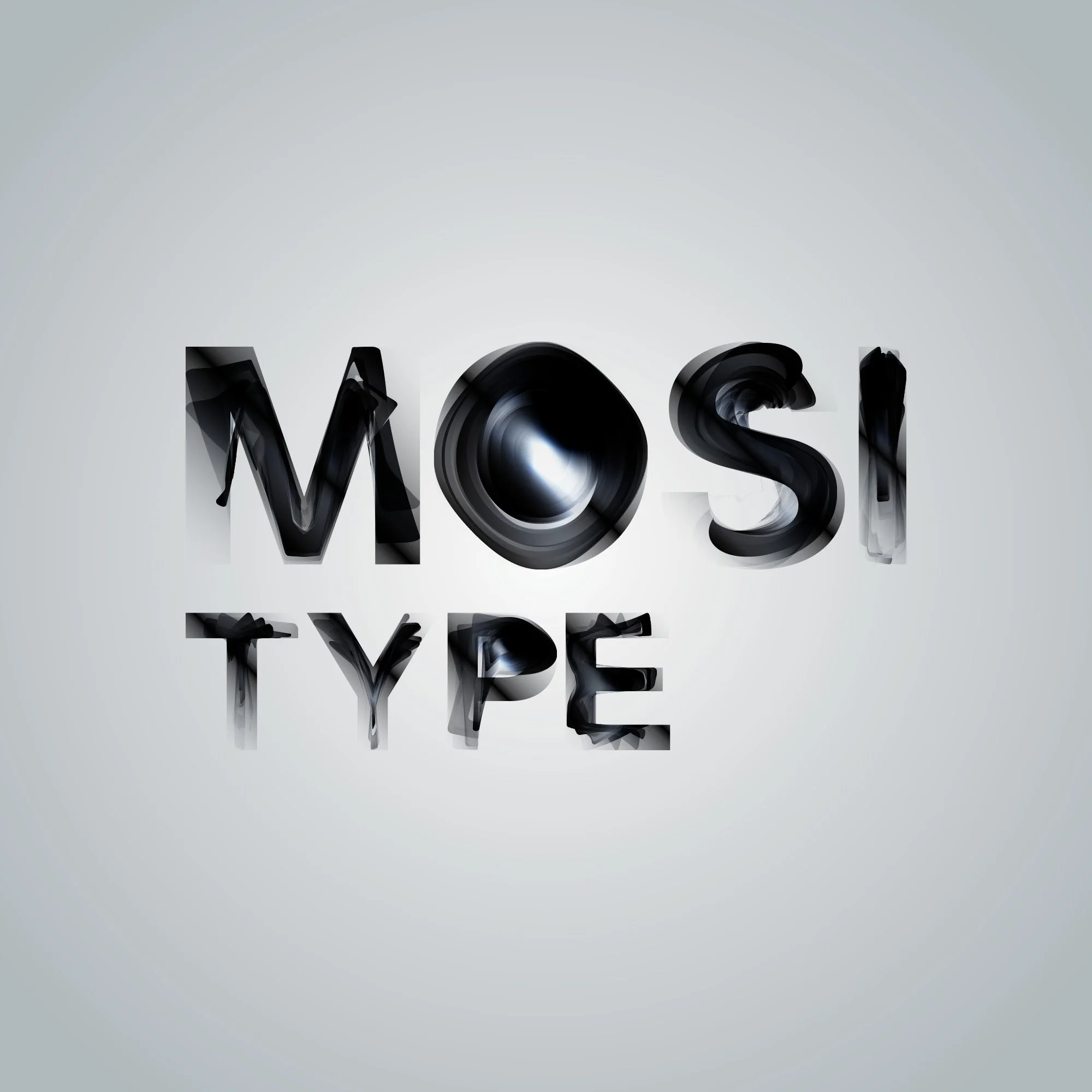
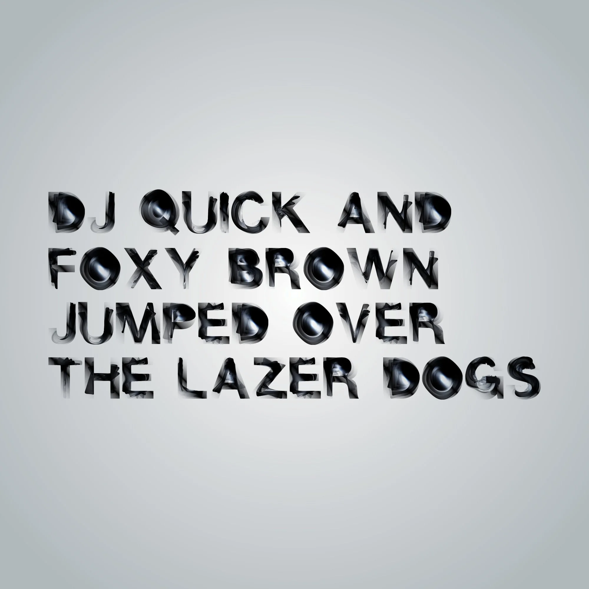
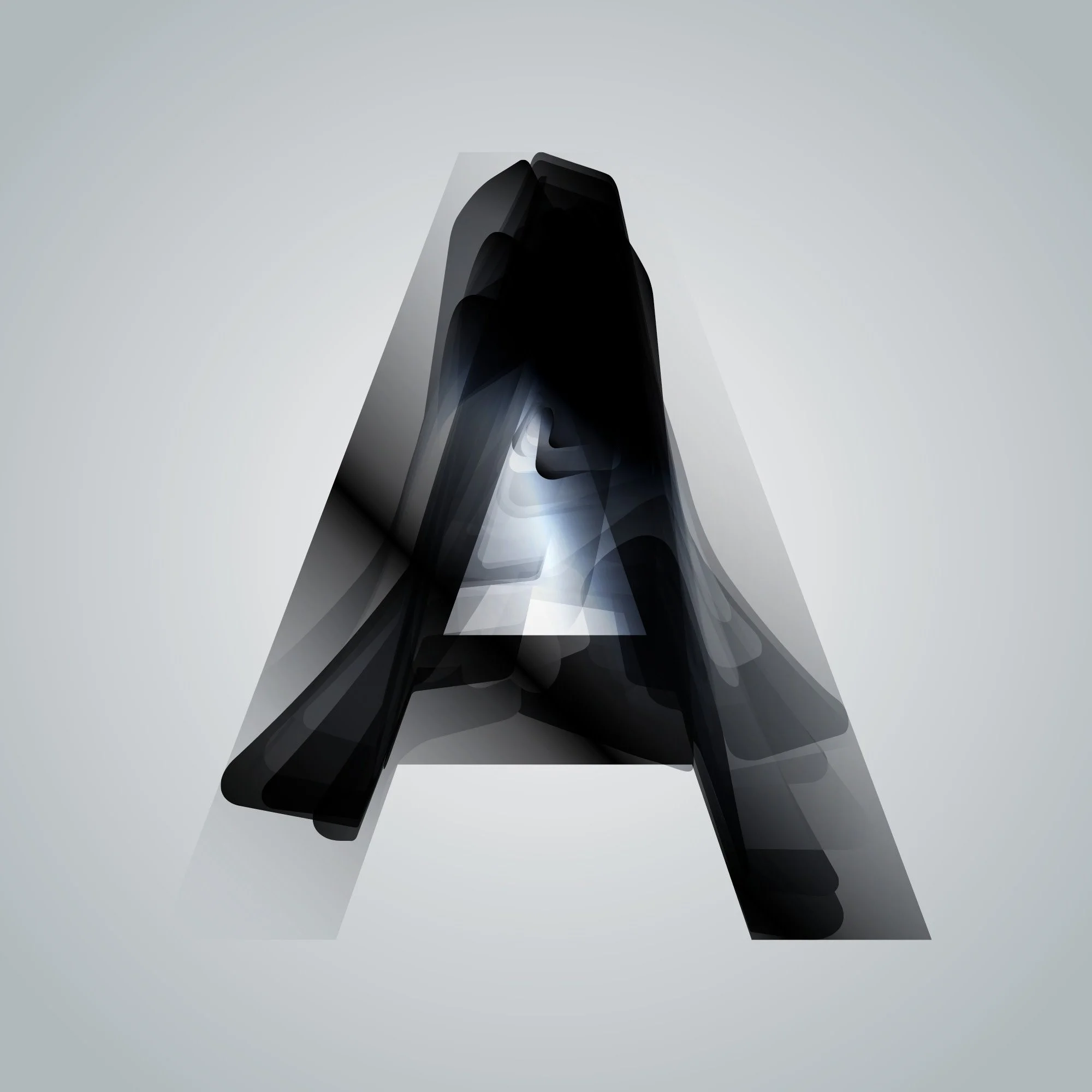
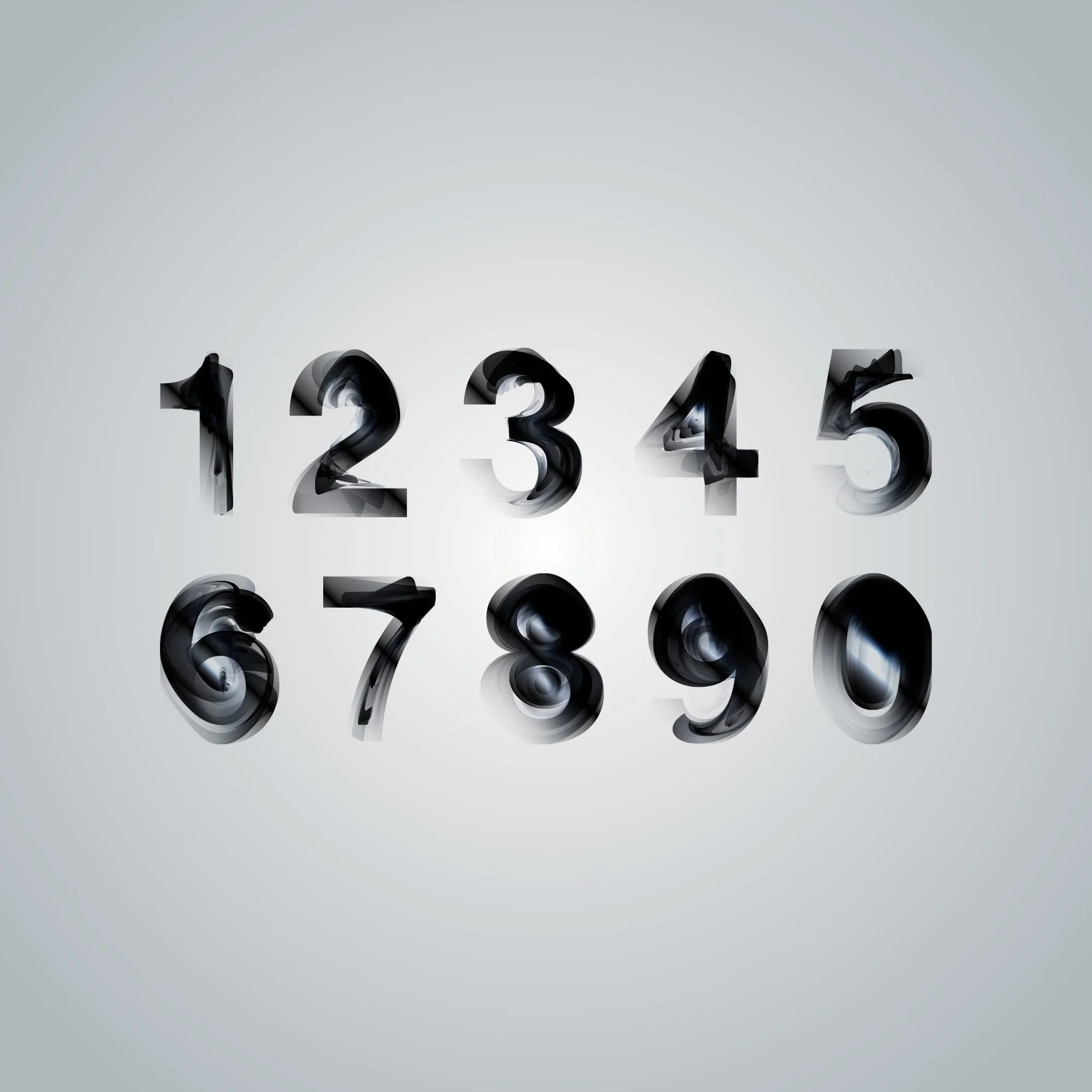
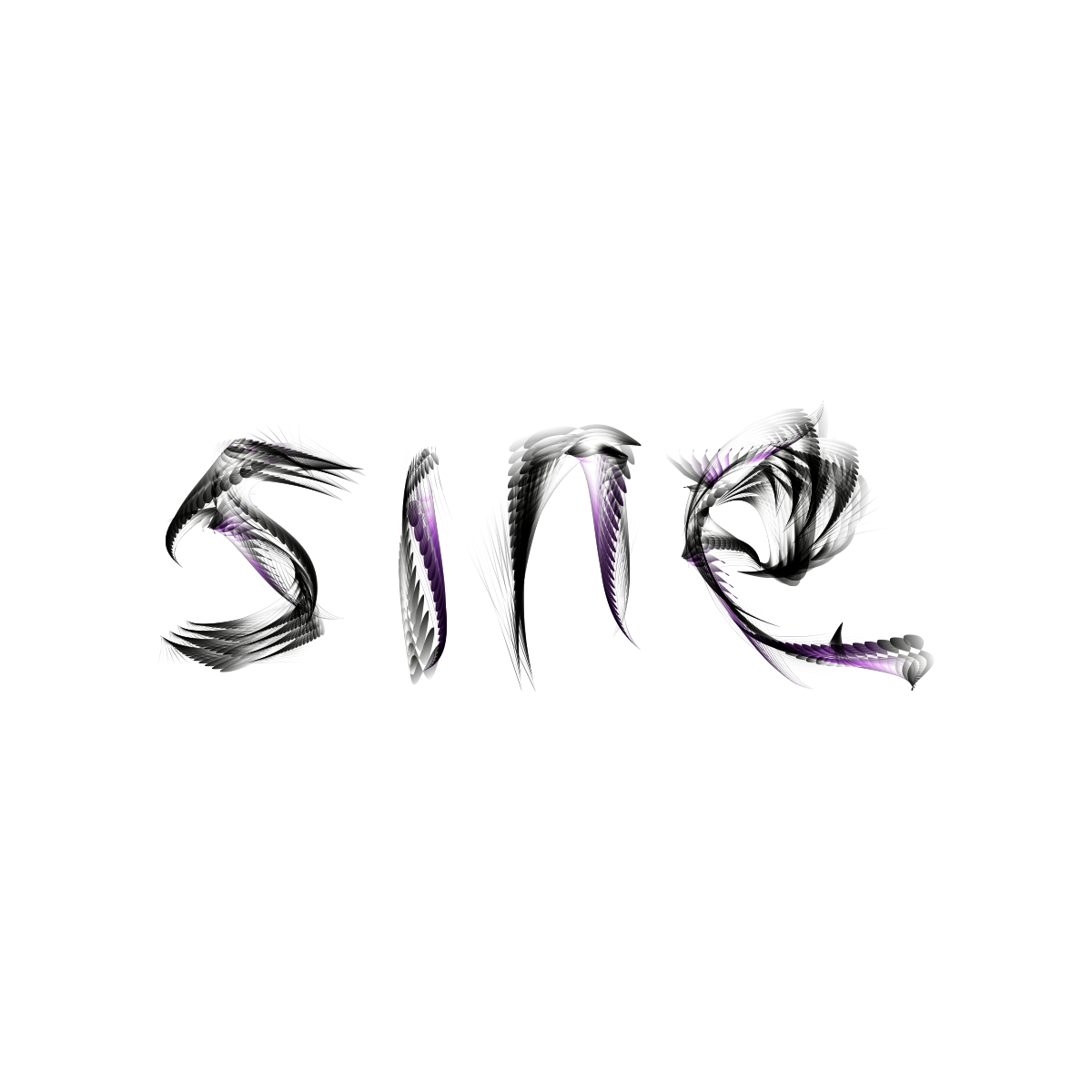
Mosi Type
Mosi Type is an experimental typographic project built around movement, blur, transparency, and layered distortion. The letterforms feel almost like they are shifting in and out of focus, somewhere between smoke, glass, ink, and motion trails.
The project started as a visual exploration of how far type can be pushed before it stops behaving like clean typography and becomes more like an image. It still holds onto structure and readability, but the details are unstable, soft, and atmospheric.
The result is a type experiment that feels physical and abstract at the same time, with each letter carrying its own sense of depth, weight, and motion.